#poland

On The First Issue Of Vogue Polska

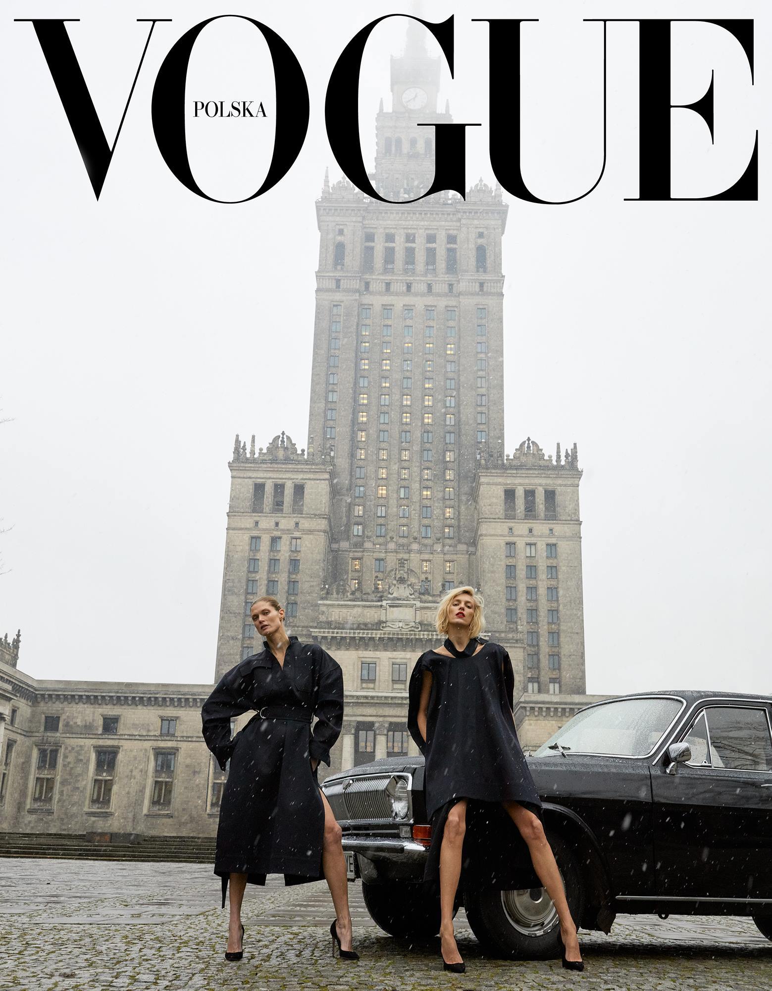
For something a bit different today: the cover of the first issue of Vogue Polska. The Palace of Culture and Science is just completely arresting to see in real life, originally an unwanted Soviet gift, it somehow has a might incomparable to more modern skyscrapers. I love this moody cover which features it front-and-centre.

Two women in stylish black coats and high heels pose confidently by a vintage black car, with one leg forward. They stand in front of the towering Palace of Culture and Science in Warsaw on a gray, snowy day. The words “VOGUE Polska” are at the top.
Juergen Teller, 2018.

I also can’t resist quoting this section from its’ Wikipedia article:

A number of nicknames have been used to refer to the palace, notably Pekin (“Beijing”, because of its abbreviated name PKiN), Pajac (“clown”, a word that sounds close to Pałac), and the “Drunk Confectioner’s Nightmarish Dream” (koszmarny sen pijanego cukiernika), attributed to poet Władysław Broniewski. Other nicknames include the “Syringe” (strzykawka), the “Elephant in Lacy Underwear” (słoń w koronowych gatkach), the “Russian Wedding Cake” (ruski tort) and “Stalin’s rocket” (rakieta Stalina), as well as more pejorative appelations like “Stalin’s dick” (chuj Stalina).

On Polish movie posters

A framed poster for the film Powiększenie (Blow-Up) by Michelangelo Antonioni features a portrait made of small black, red, and purple dots. The poster rests against a white wall, above clutter including snacks and papers.

My friend Charlie read this article (The Insane History of Polish Movie Posters) the other day and ended up sending me a print of one of them, because he knew I’d like it, and he was obviously right. I was so excited to display it I whacked it on the nearest available surface, hence why it’s currently hiding behind M&S vouchers. I didn’t clock this initially, I was so taken in by the colours, but from the top of the stairs (and a little bit in this picture too) it looks like a face. It’s great.

A surreal, abstract poster for Who’s Afraid of Virginia Woolf? by Edward Albee. It depicts distorted, merging human faces with exaggerated features, skeletal elements, and jagged shapes. The text is in Polish, with dramatic, expressive lines and muted colors.

I promise not to turn this into a Polish Poster Blog, but another one of my favourites is the poster for “Who’s Afraid of Virginia Woolf?” by Franciszek Starowieyski. I have a print of it somewhere. I’ll level with you – it’s quite ugly! You’d think one of the keystones of good design is that the item is pleasing to look at, and this is anything but, so how exhilarating that an artist has the freedom to create something which doesn’t conform to that expectation? I think it catches your attention, which makes it very effective nevertheless. For a start, when I saw it on eBay I couldn’t stop thinking about it until I purchased it.

Here’s the article, and I recommend reading it if only to find out the fascinating reason behind why communist Poland had such a vibrant movie poster design culture.