Late 90’s/early 00’s technology, design, and marketing were all so weird in a very specific way. It’s a shame we lost that. 404 Media details the release of the Nokia Design Archive. I enjoy this one particularly:
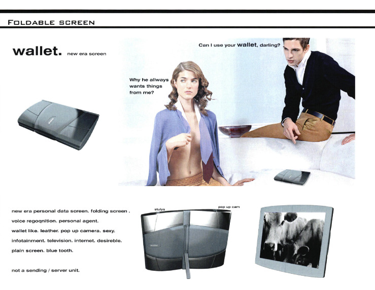
Is everything OK at home, Nokia?

Late 90’s/early 00’s technology, design, and marketing were all so weird in a very specific way. It’s a shame we lost that. 404 Media details the release of the Nokia Design Archive. I enjoy this one particularly:
Is everything OK at home, Nokia?
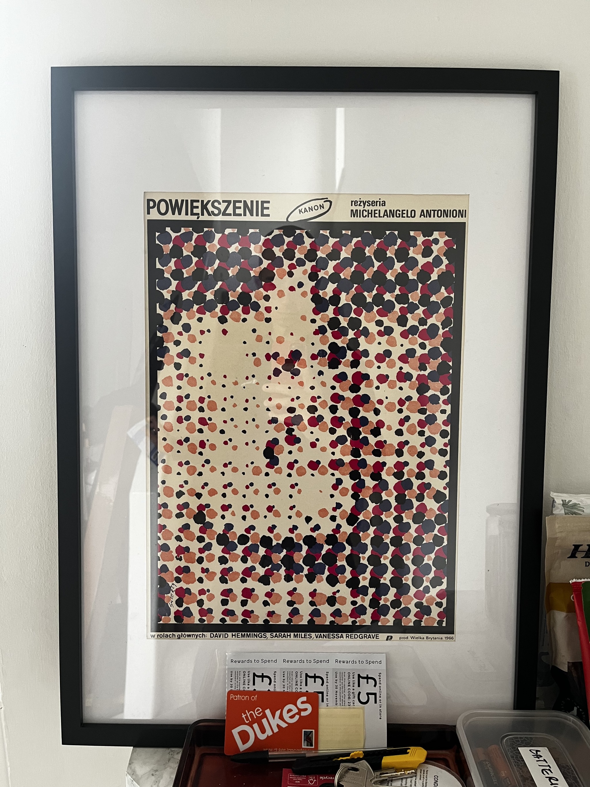
My friend Charlie read this article (The Insane History of Polish Movie Posters) the other day and ended up sending me a print of one of them, because he knew I’d like it, and he was obviously right. I was so excited to display it I whacked it on the nearest available surface, hence why it’s currently hiding behind M&S vouchers. I didn’t clock this initially, I was so taken in by the colours, but from the top of the stairs (and a little bit in this picture too) it looks like a face. It’s great.

I promise not to turn this into a Polish Poster Blog, but another one of my favourites is the poster for “Who’s Afraid of Virginia Woolf?” by Franciszek Starowieyski. I have a print of it somewhere. I’ll level with you – it’s quite ugly! You’d think one of the keystones of good design is that the item is pleasing to look at, and this is anything but, so how exhilarating that an artist has the freedom to create something which doesn’t conform to that expectation? I think it catches your attention, which makes it very effective nevertheless. For a start, when I saw it on eBay I couldn’t stop thinking about it until I purchased it.
Here’s the article, and I recommend reading it if only to find out the fascinating reason behind why communist Poland had such a vibrant movie poster design culture.
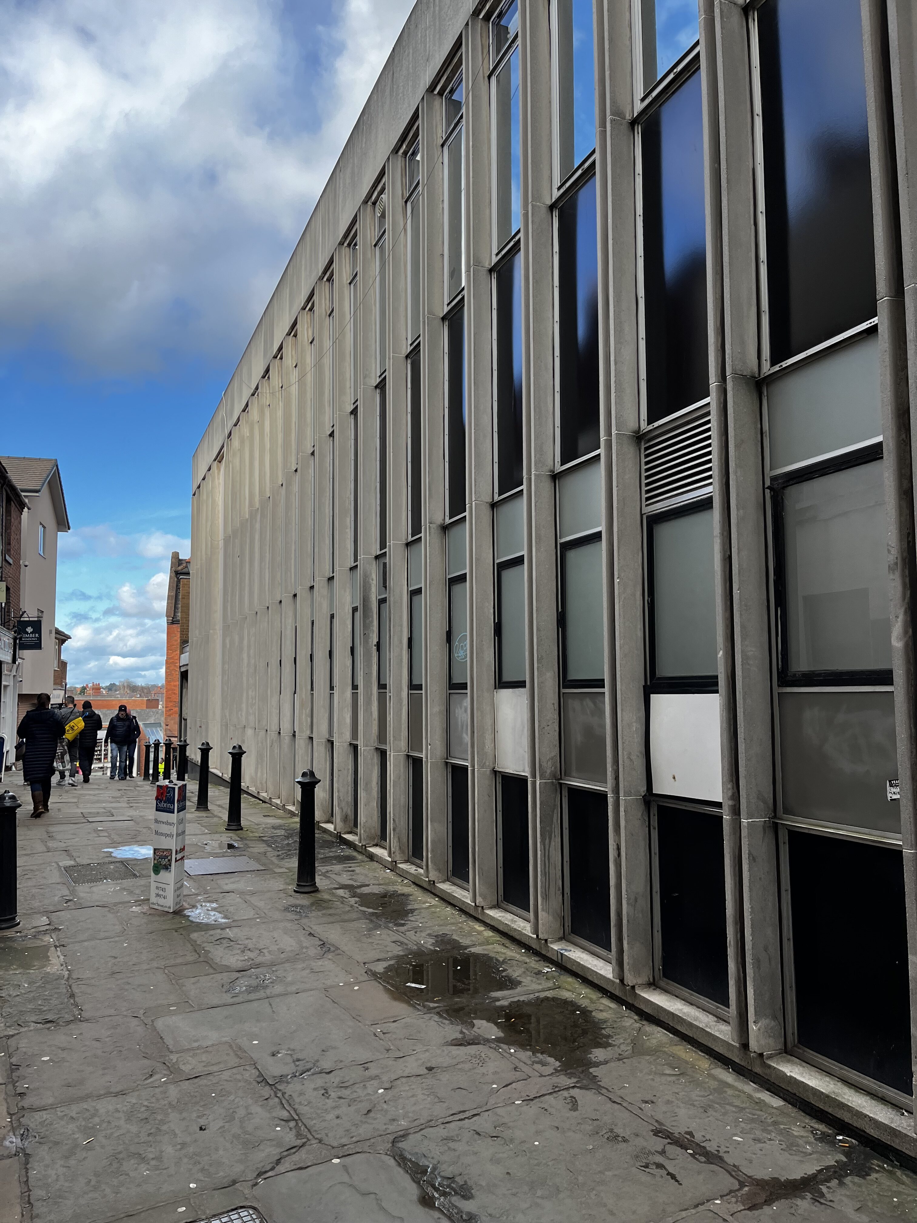
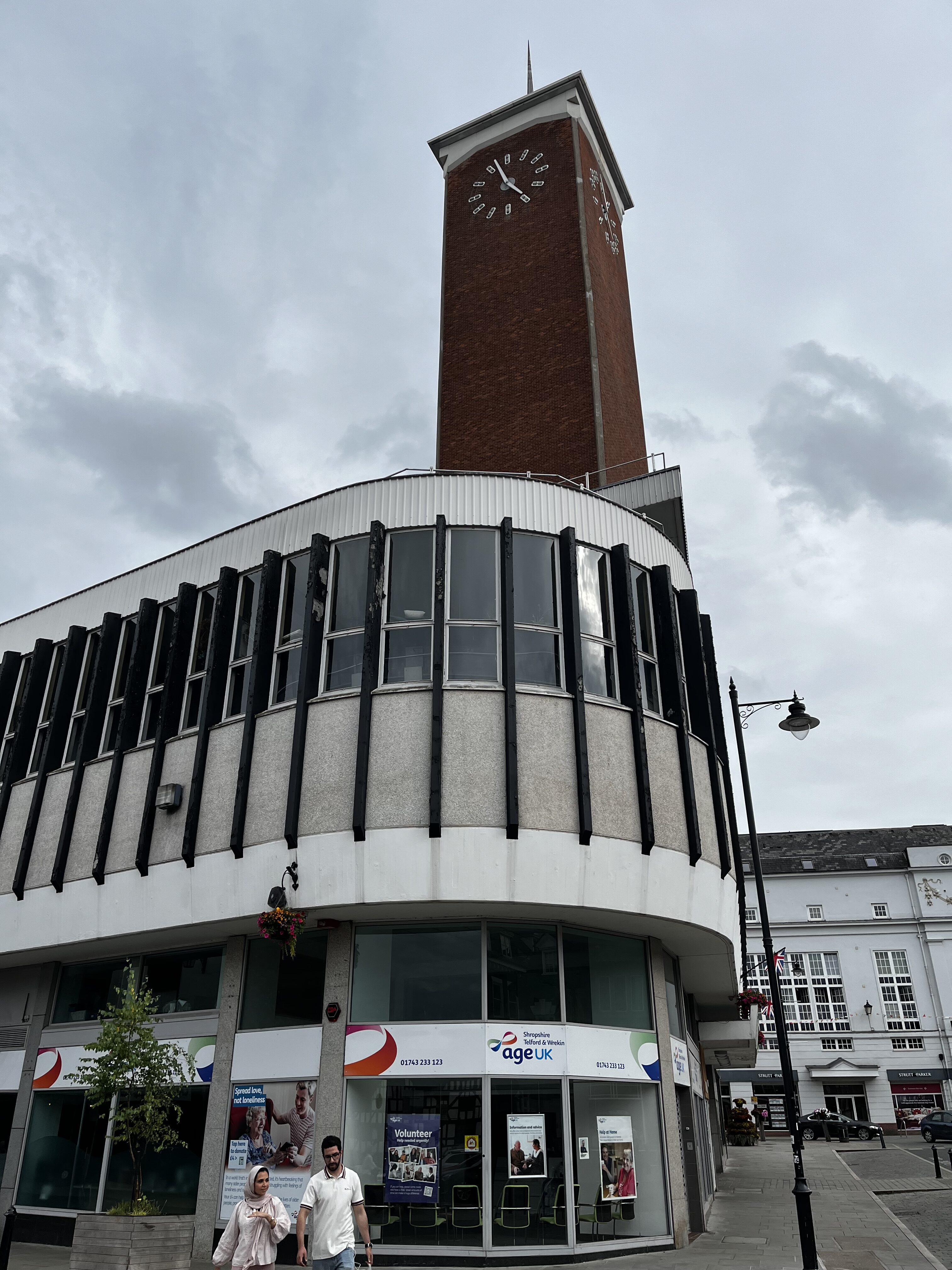
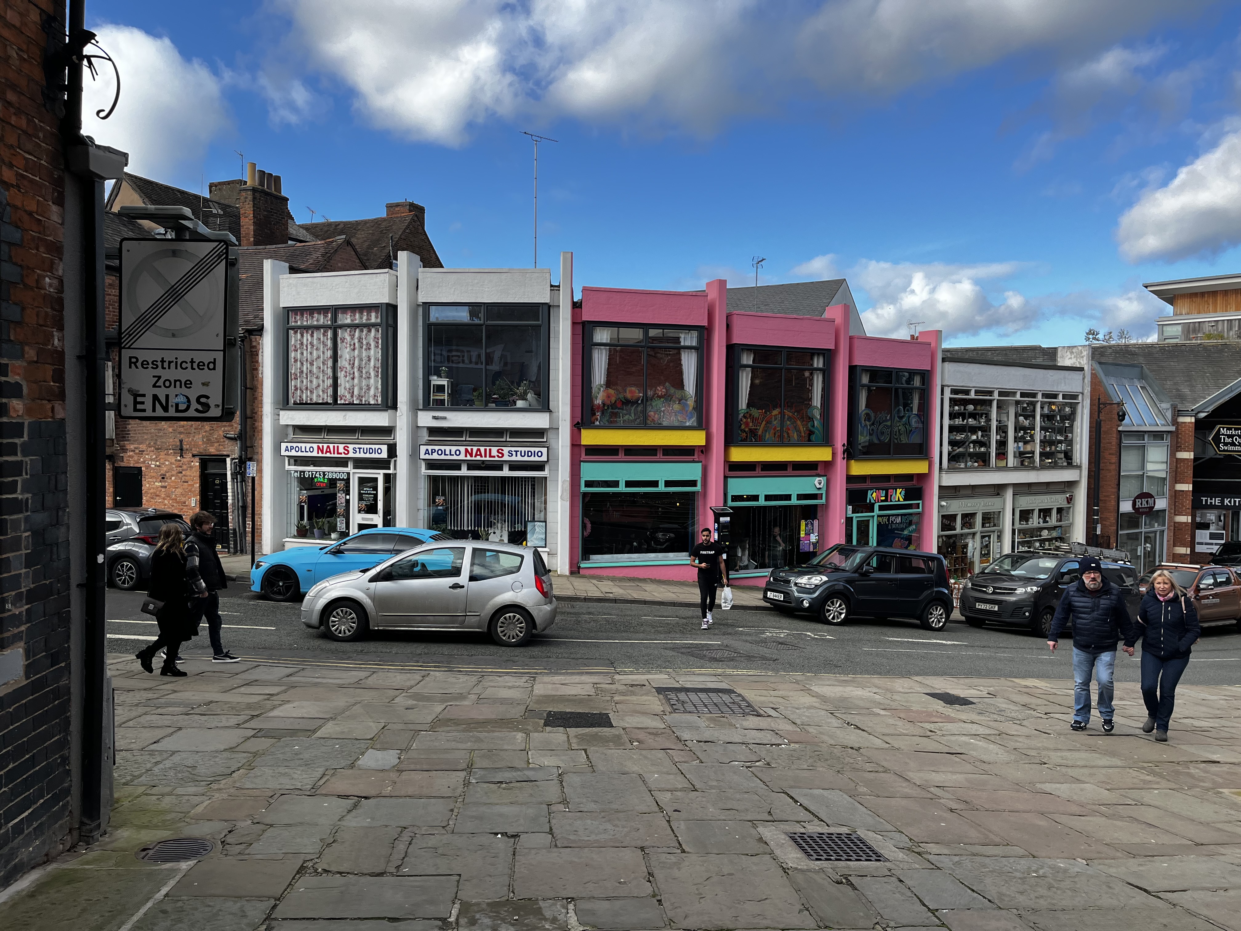
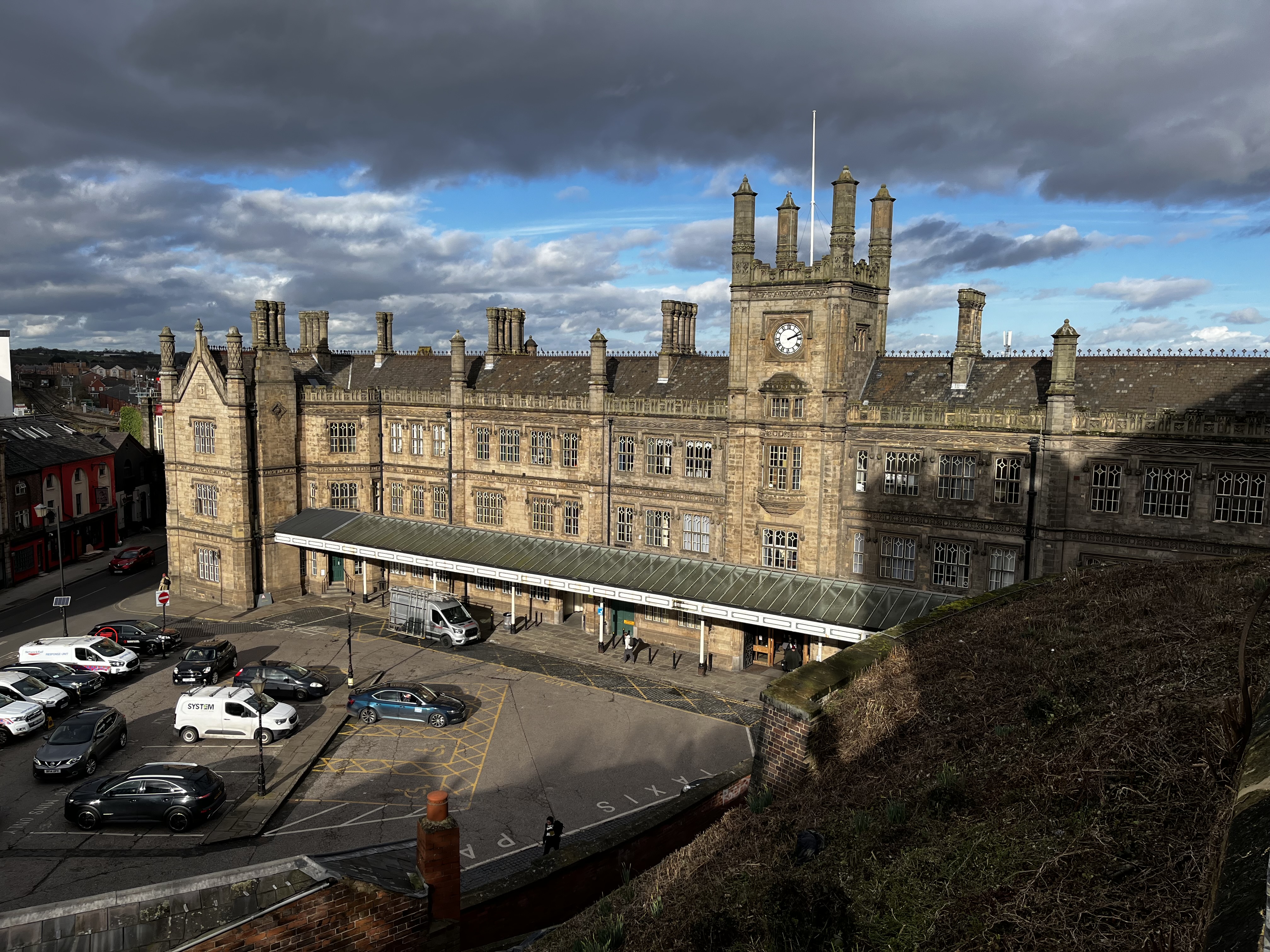
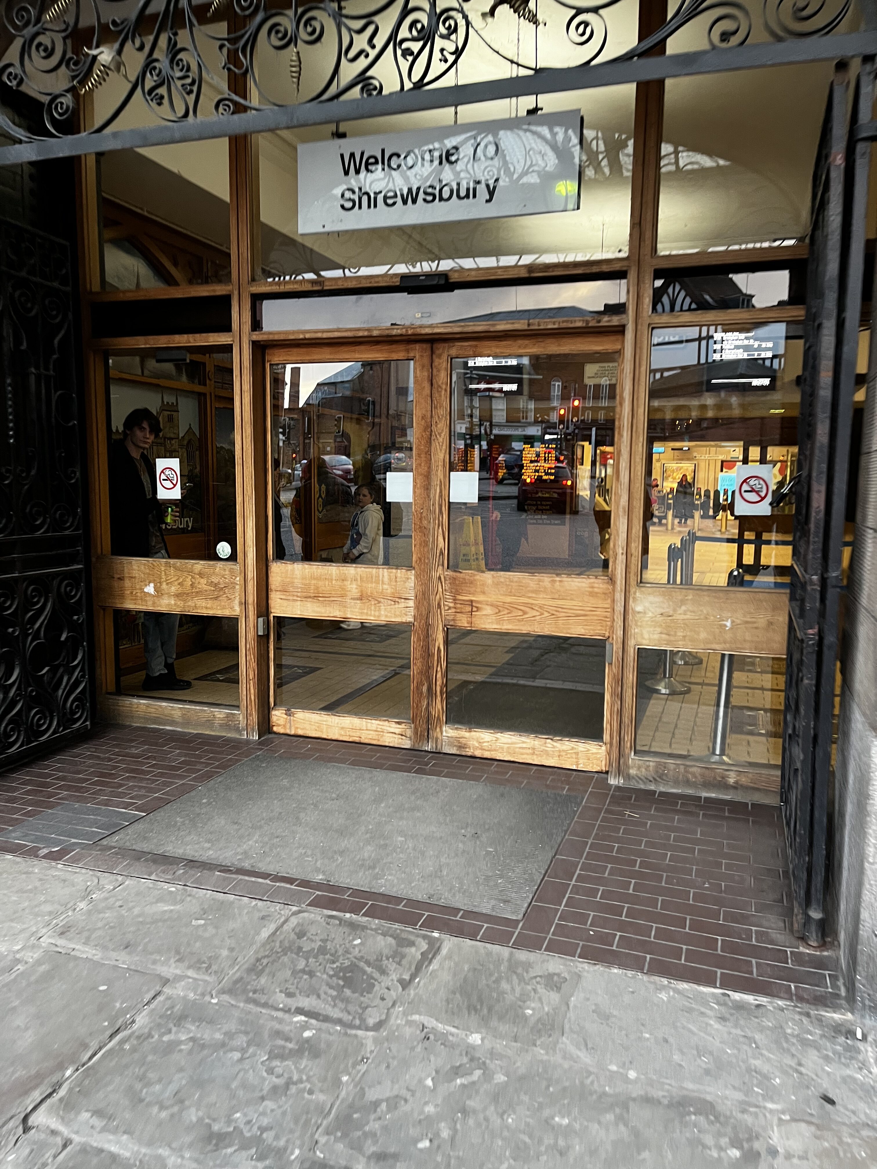

Some bits from Shrewsbury [12/02/24 + 04/08/24]. I was planning to do Sheffield but got waylaid by the sight of the market hall in my photo library.
From top to bottom:
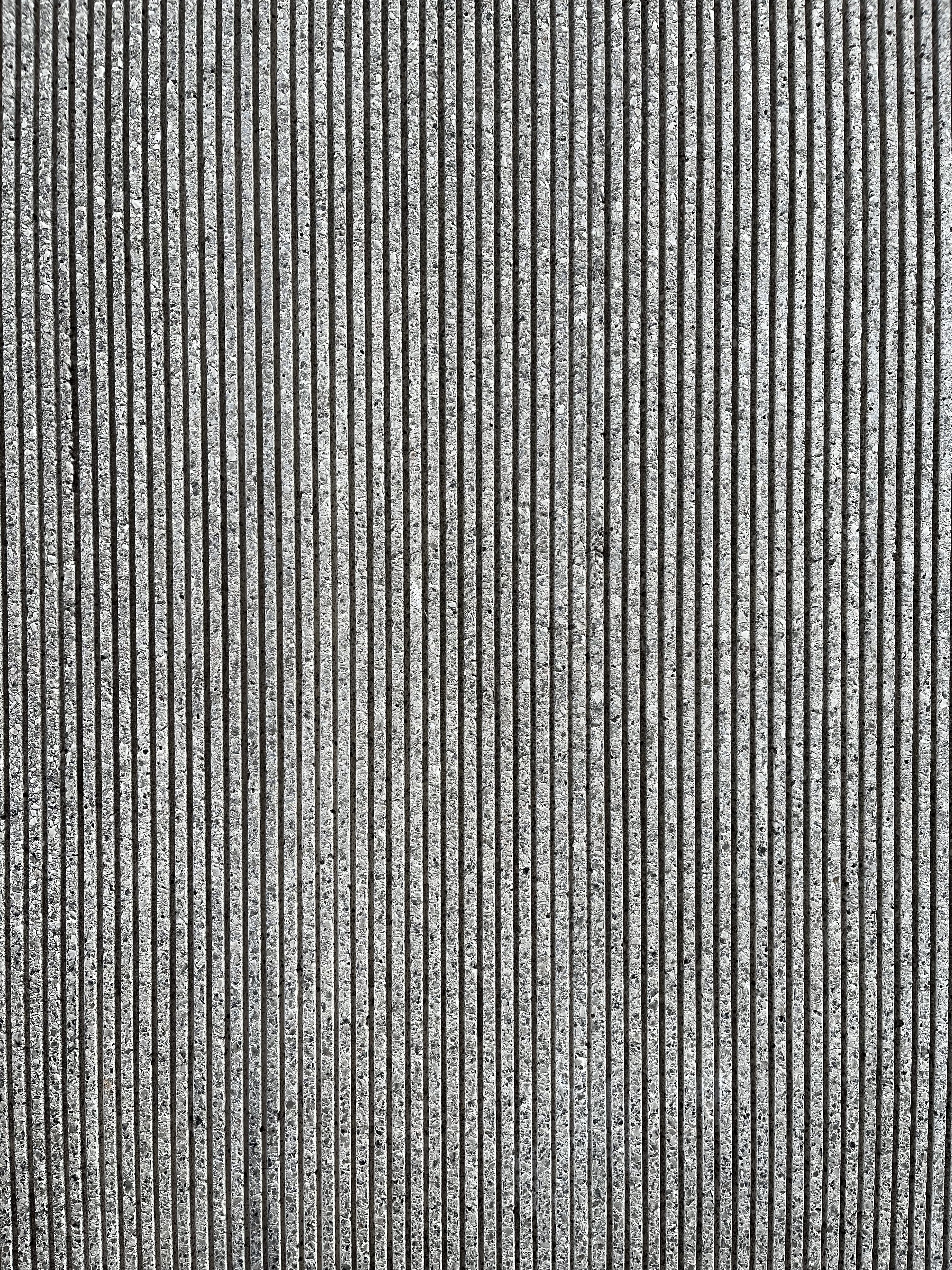
The side of the Lloyds Bank building + detail shot. I don’t have a good picture but the front is also gorgeous. I love the bulkiness a bank building warrants.
The curvaceous exterior of the Market Hall. Like all market halls, it’s yet to ever be open when I’m there, so the interior will remain a mystery (although there is a viewing platform you can go up).
A colourful row of shops.
Shrewsbury Railway Station, built in 1848, is absolutely not modernist, but I found the wooden doors with the Rail Alphabet sign above absolutely charming.
And finally, a logo on The Quarry Swimming & Fitness Centre, another one of my weaknesses.
—
Shrewsbury is a very nice market town with plenty of modernist icons to look at, more so than I’ve included here, it’s well worth a visit!