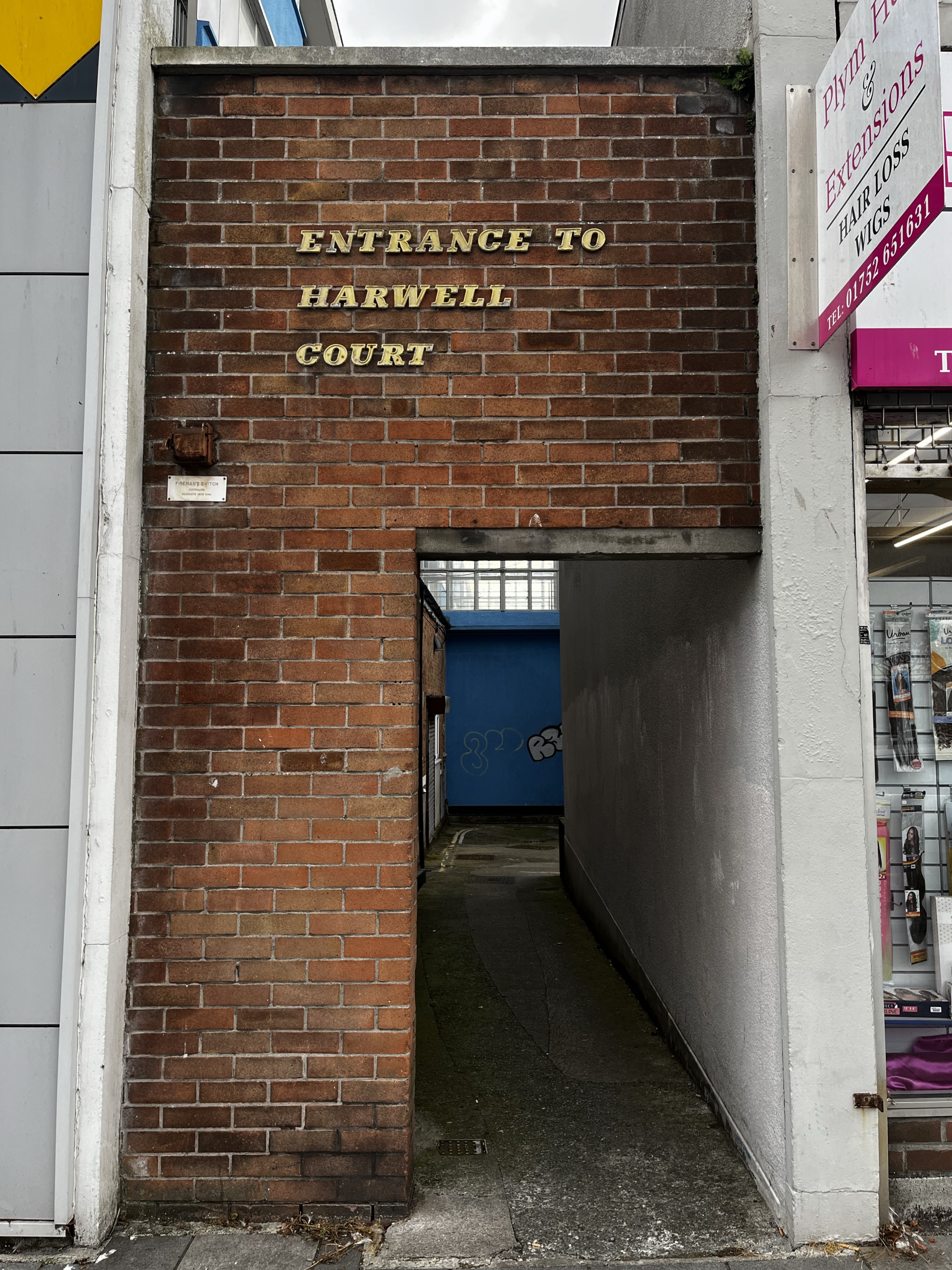
The opposite of minimalism.

The opposite of minimalism.
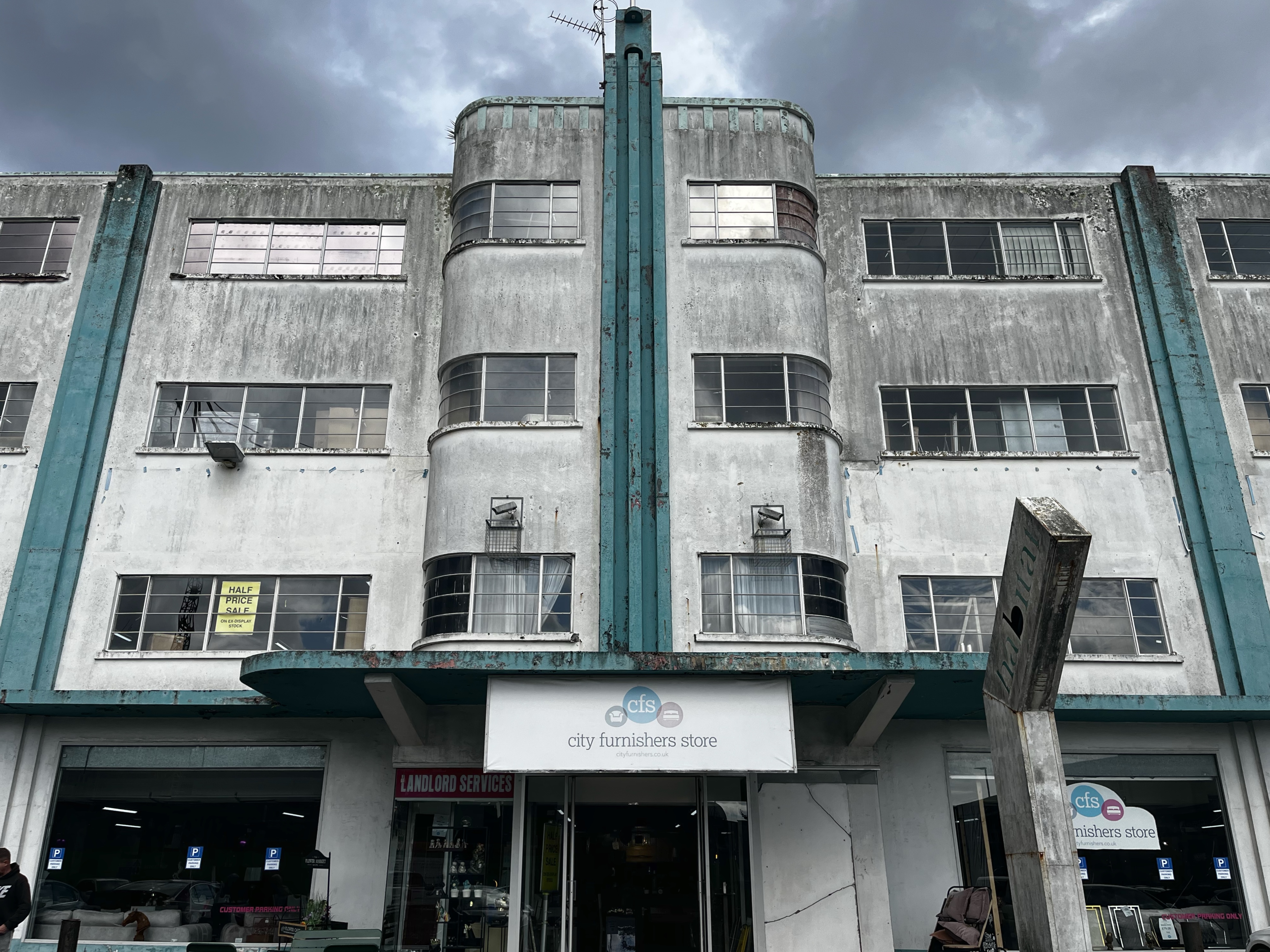
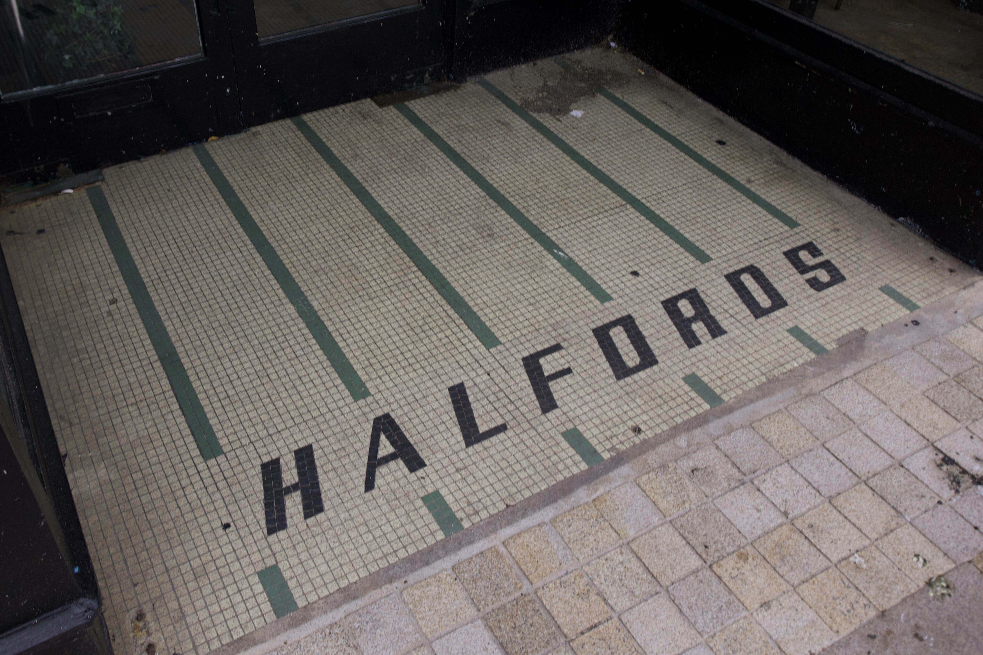
The building, which once housed a car showroom and later a Habitat store, a bookshop, and a furniture shop, failed to secure a heritage listing in 2016, but survived the threat of demolition. It remains one of the few examples of art deco architecture in Plymouth which survived the Blitz. The current tenants of the building have been told to vacate the premises just last week, with the building up for refurbishment into housing. Bring on the uPVC!
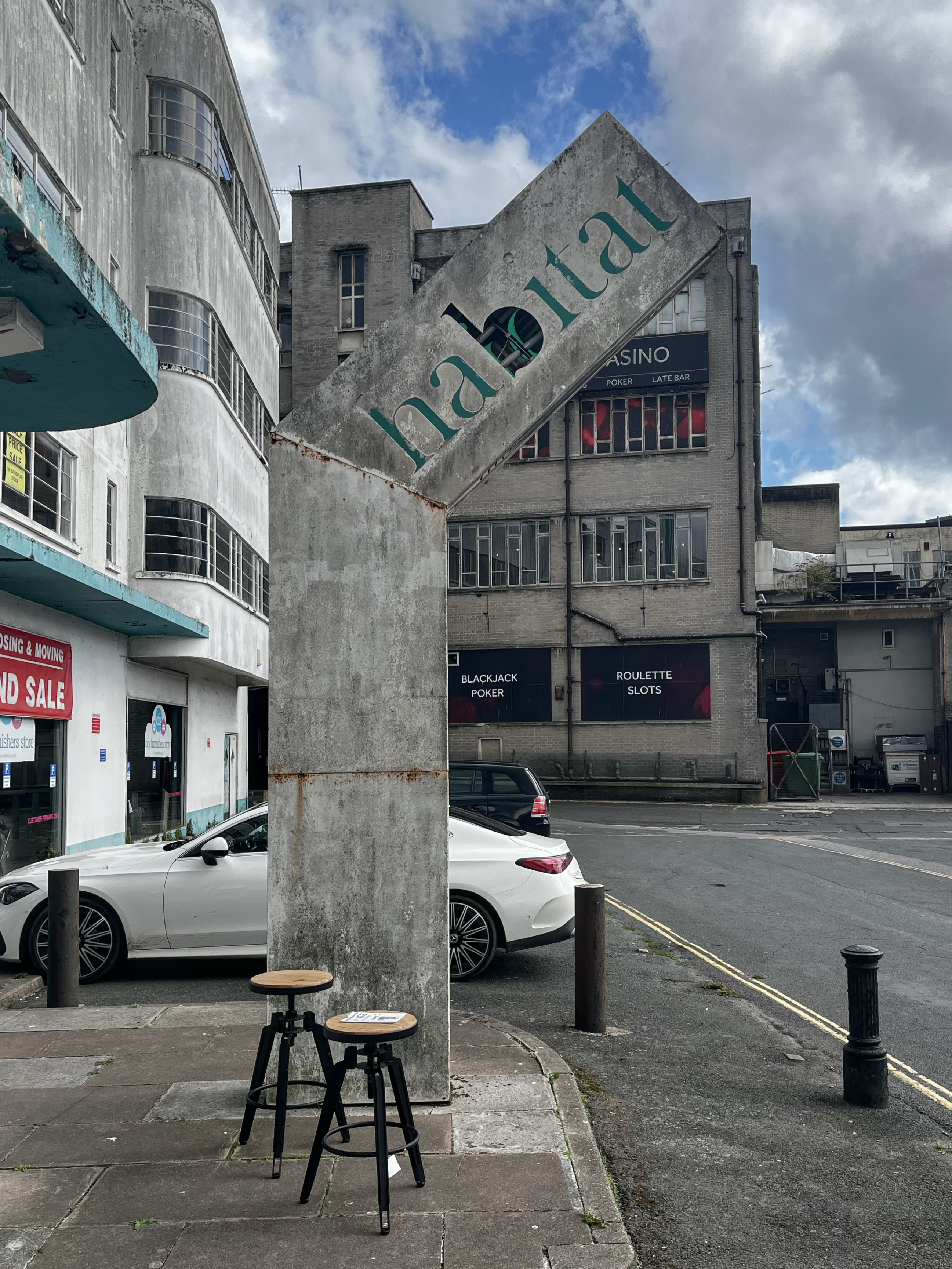
Hopefully the sign will be saved – for one, it would look great in my office.
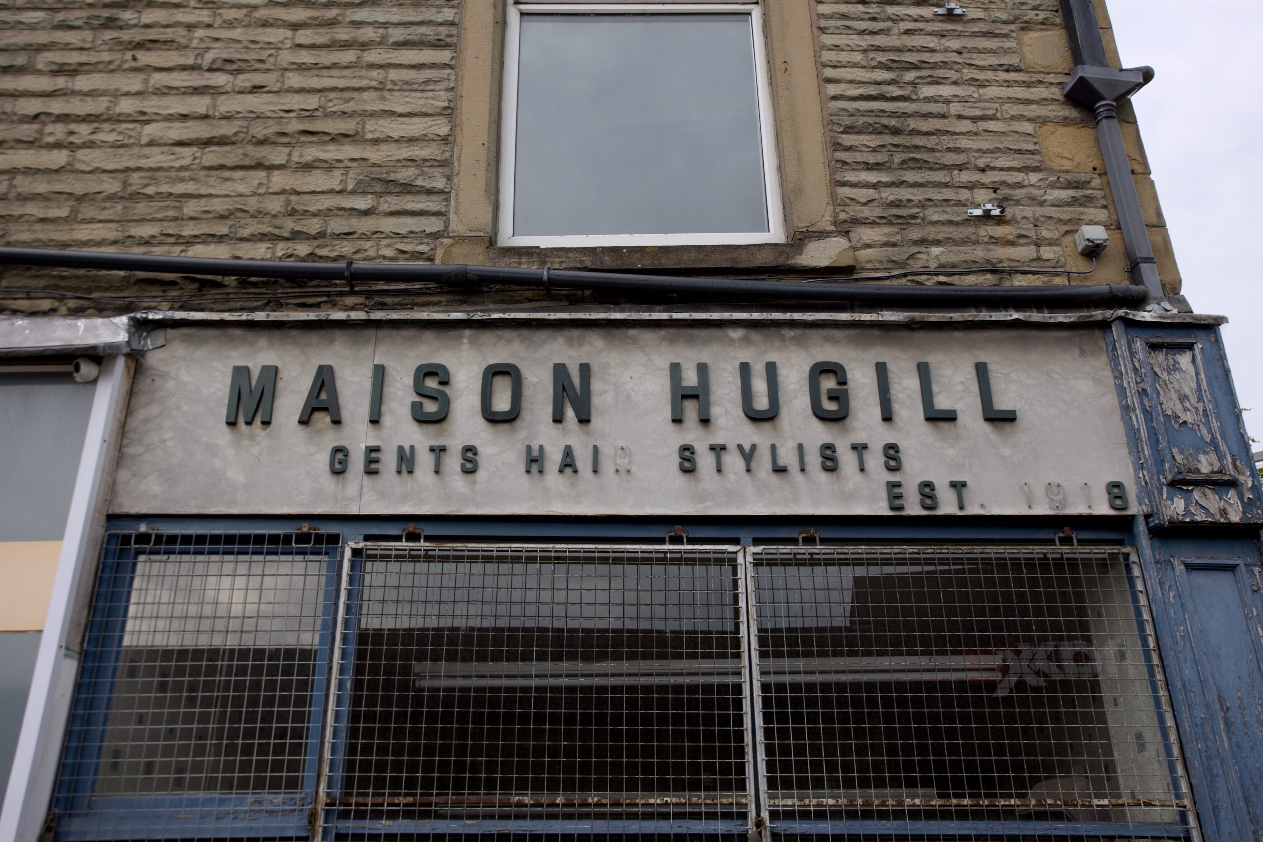
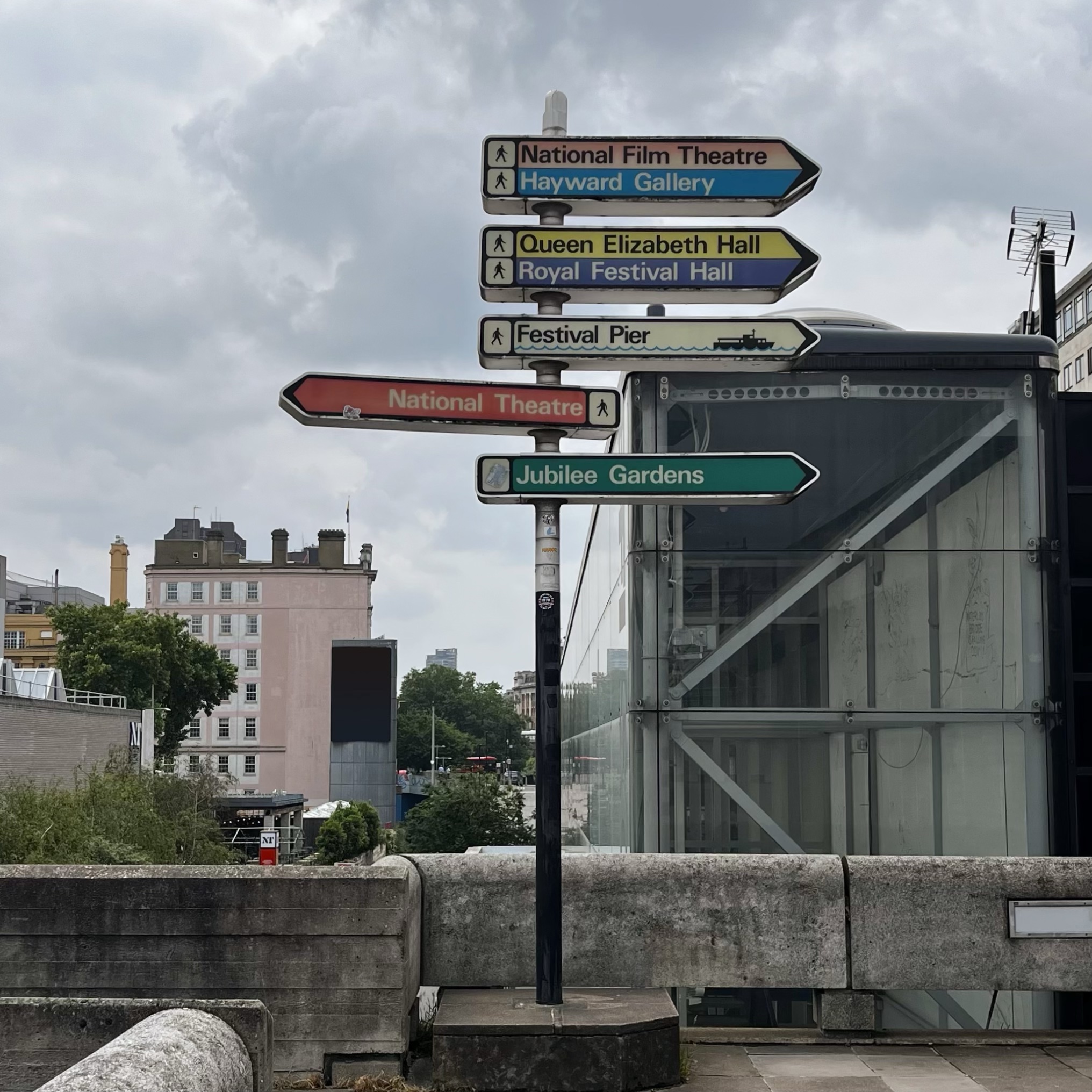
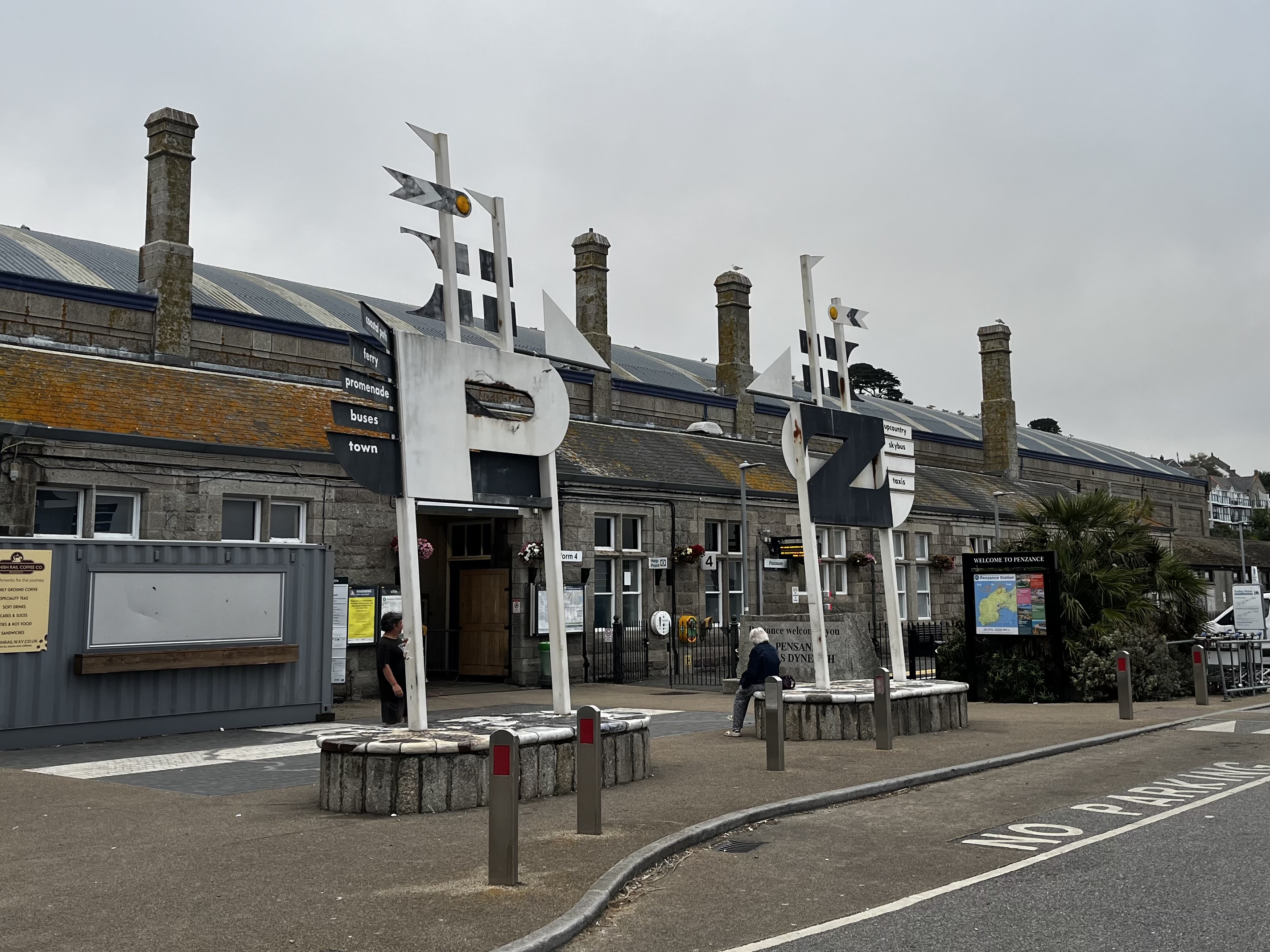
Charming use of colour and iconography (especially on the Festival Pier sign), which you don’t see in an era of consistent, unified design languages.
Bonus points if you recognise the building in the background.
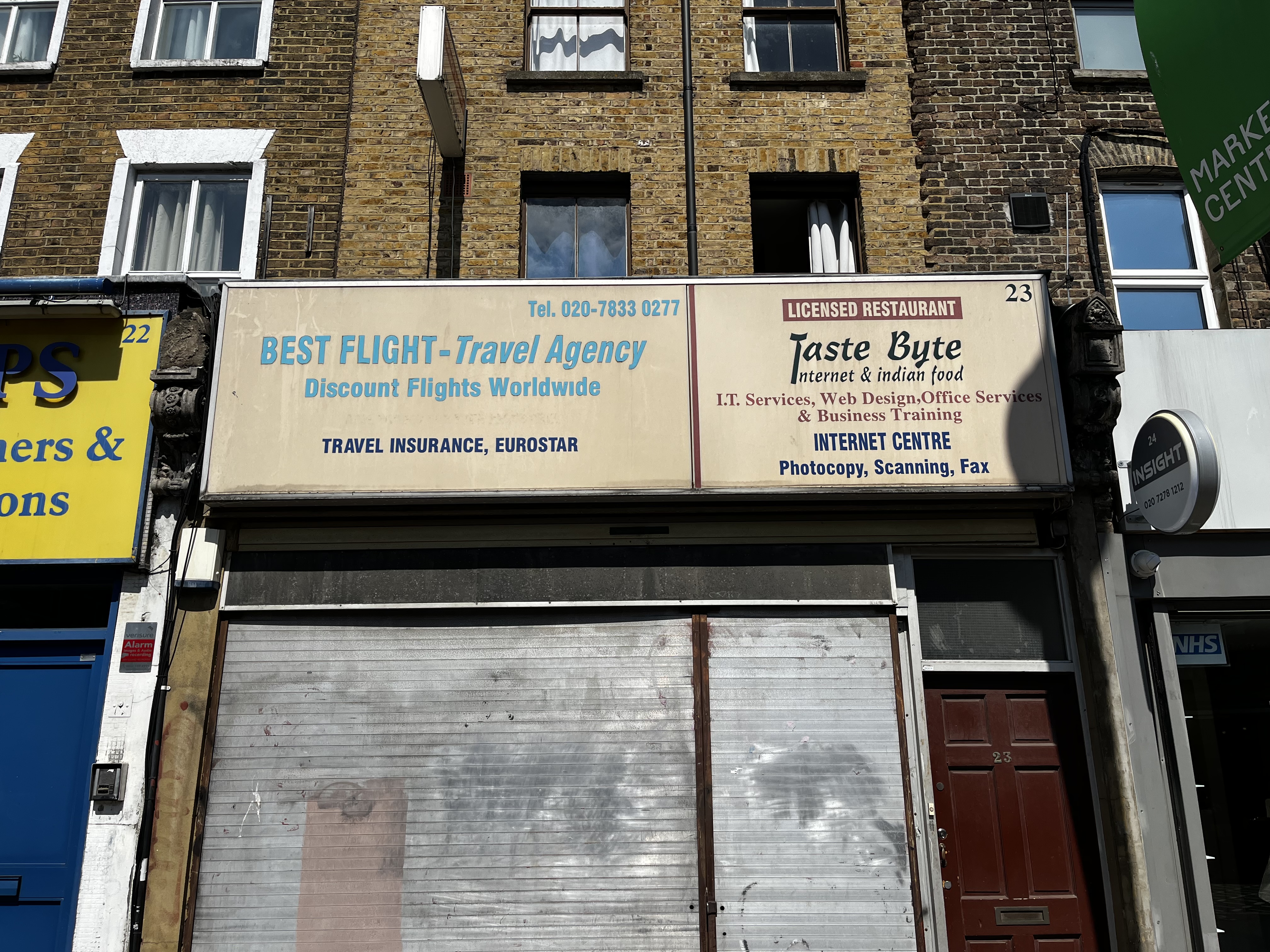
The Internet and Indian food — I would never need to leave.