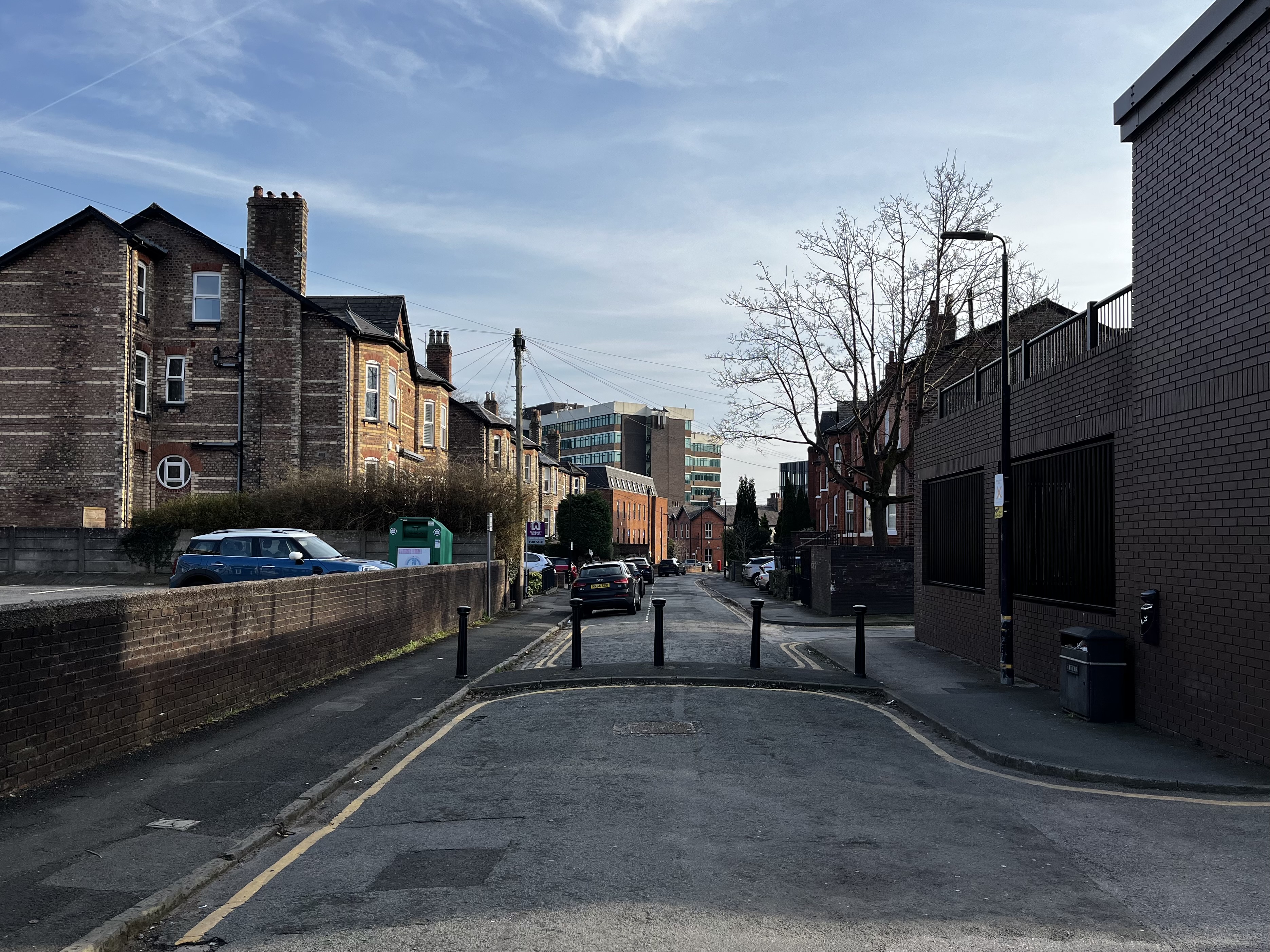
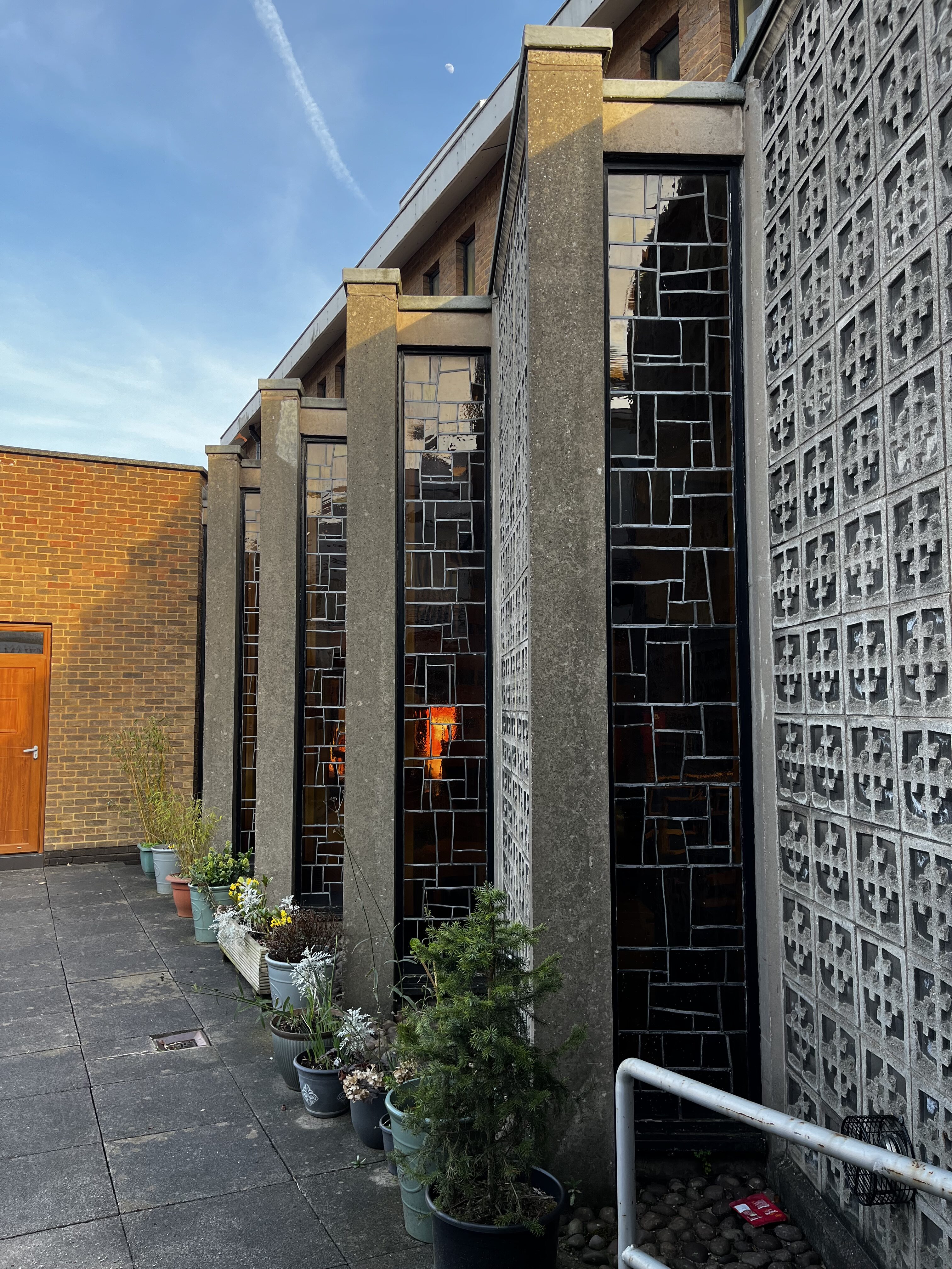
Modern overlooking old in Altrincham, 2025


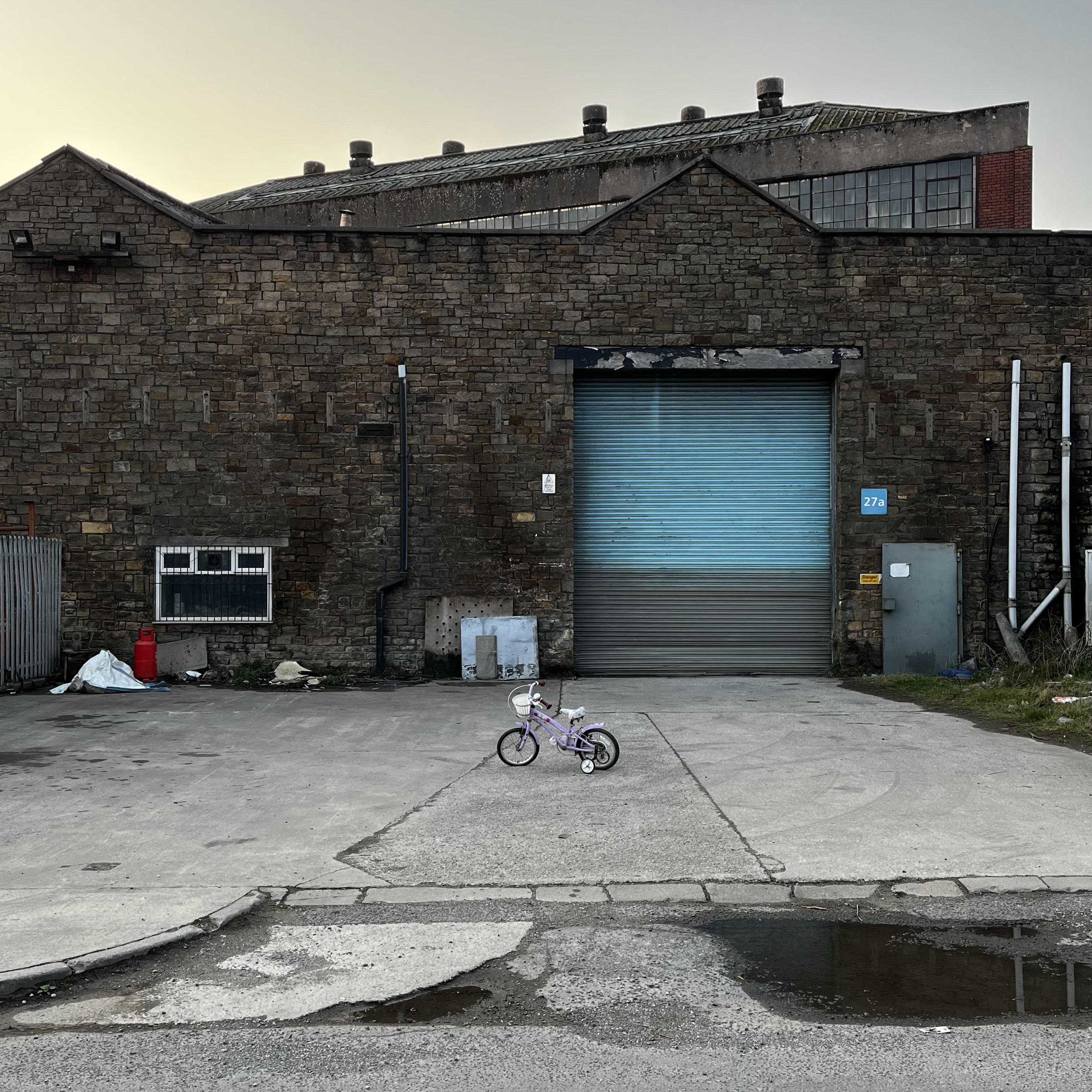
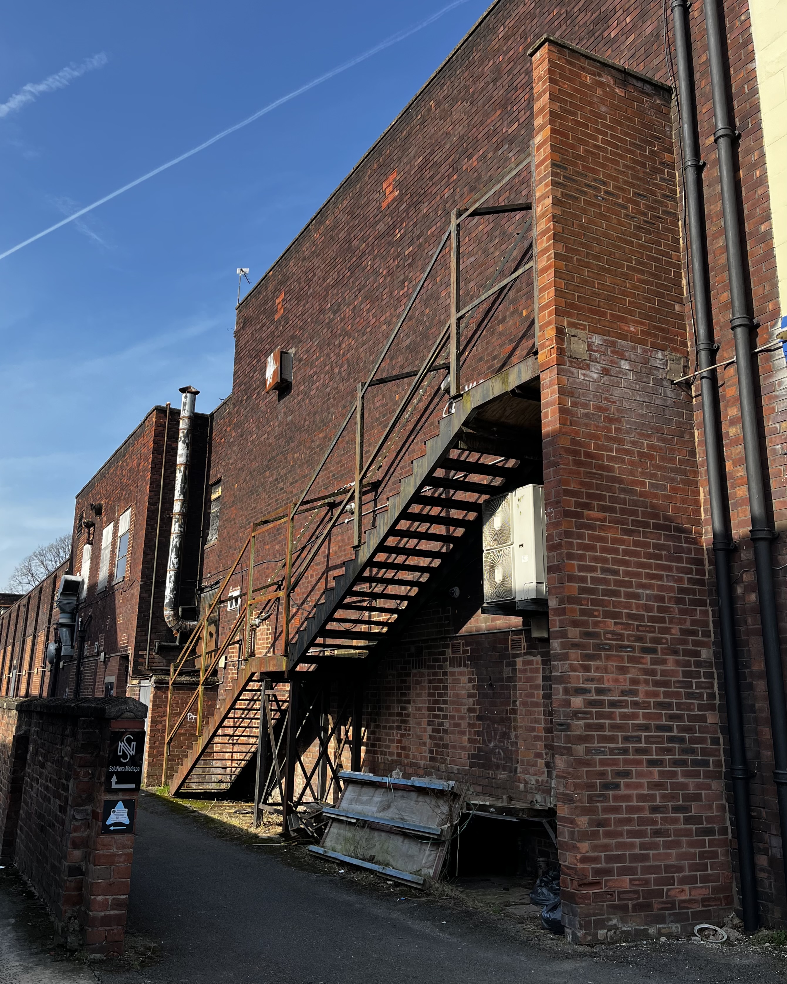
Leaving a wee kids’ bike in front of a decaying warehouse on an industrial estate just as the sun sets behind it, to me, is like the proverbial van full of sweets. After deviating from my route back from the gym to take a photo, I’m surprised I’m not in some basement with my face on a milk carton right now.
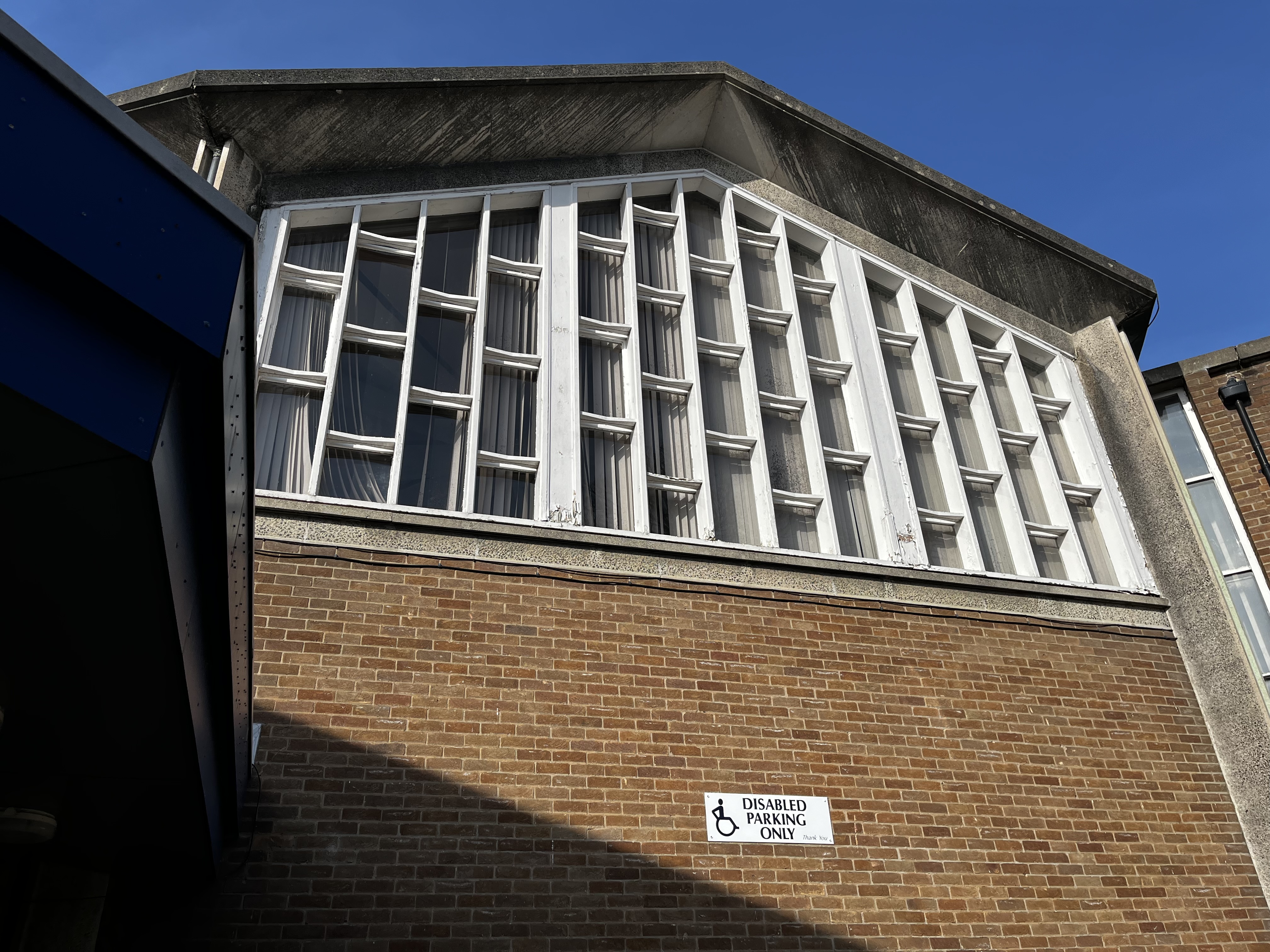
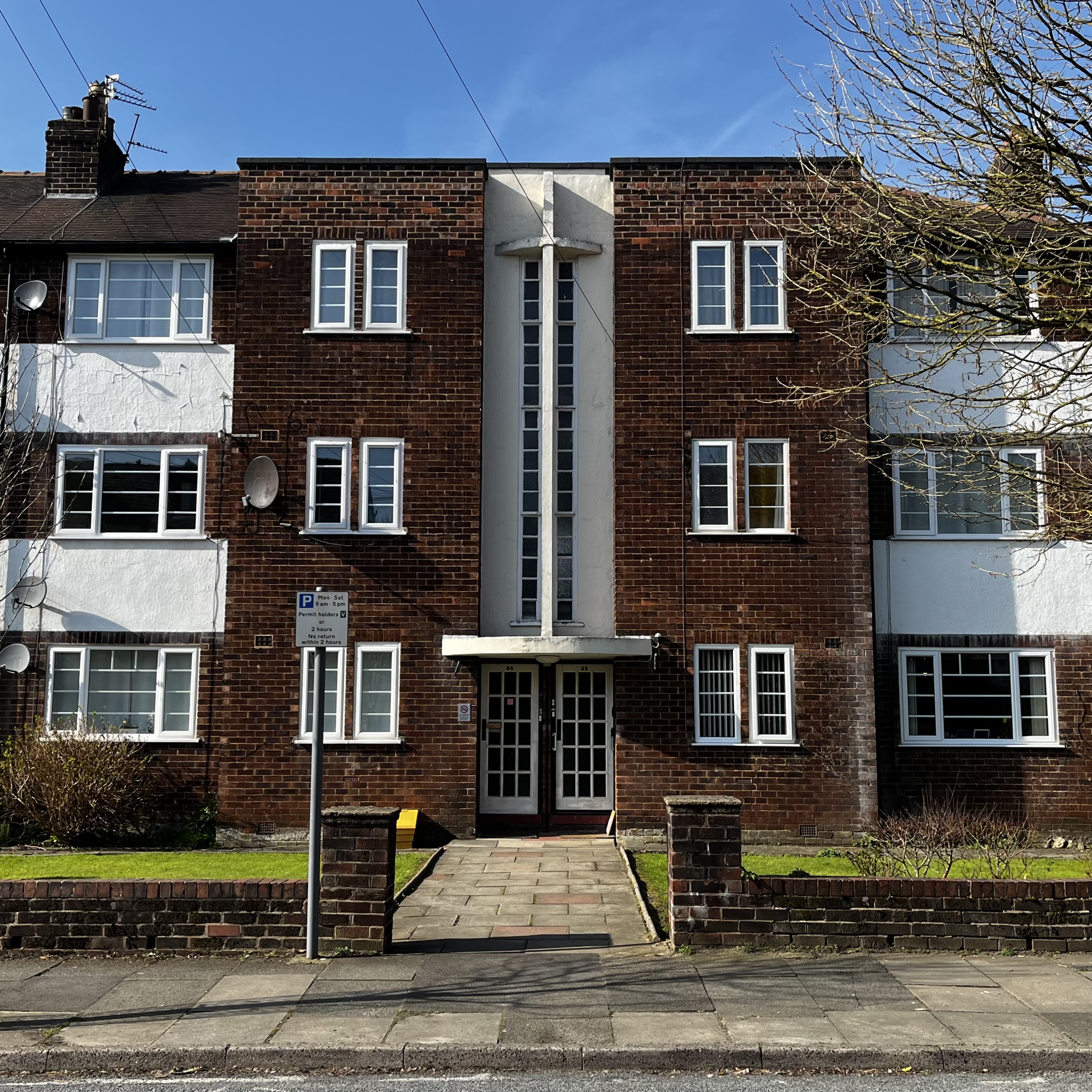
Squint and pretend you can’t see the uPVC!
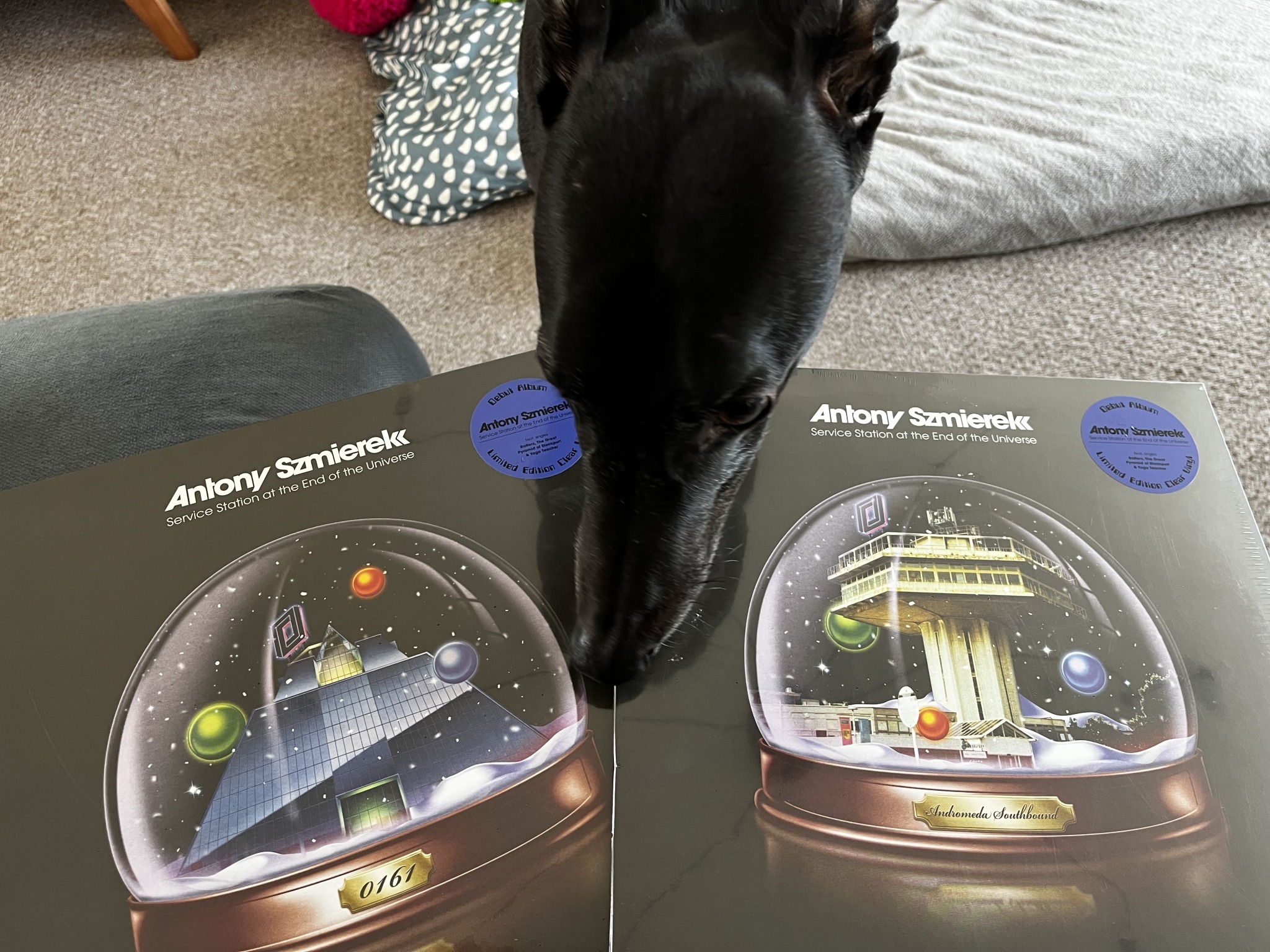
I don’t like the music of Antony Szmierek enough to own his albums in duplicate, but how could I refuse with gorgeous album art like that? This one’s going right in my Forton Services shrine. Nosy greyhound notwithstanding.