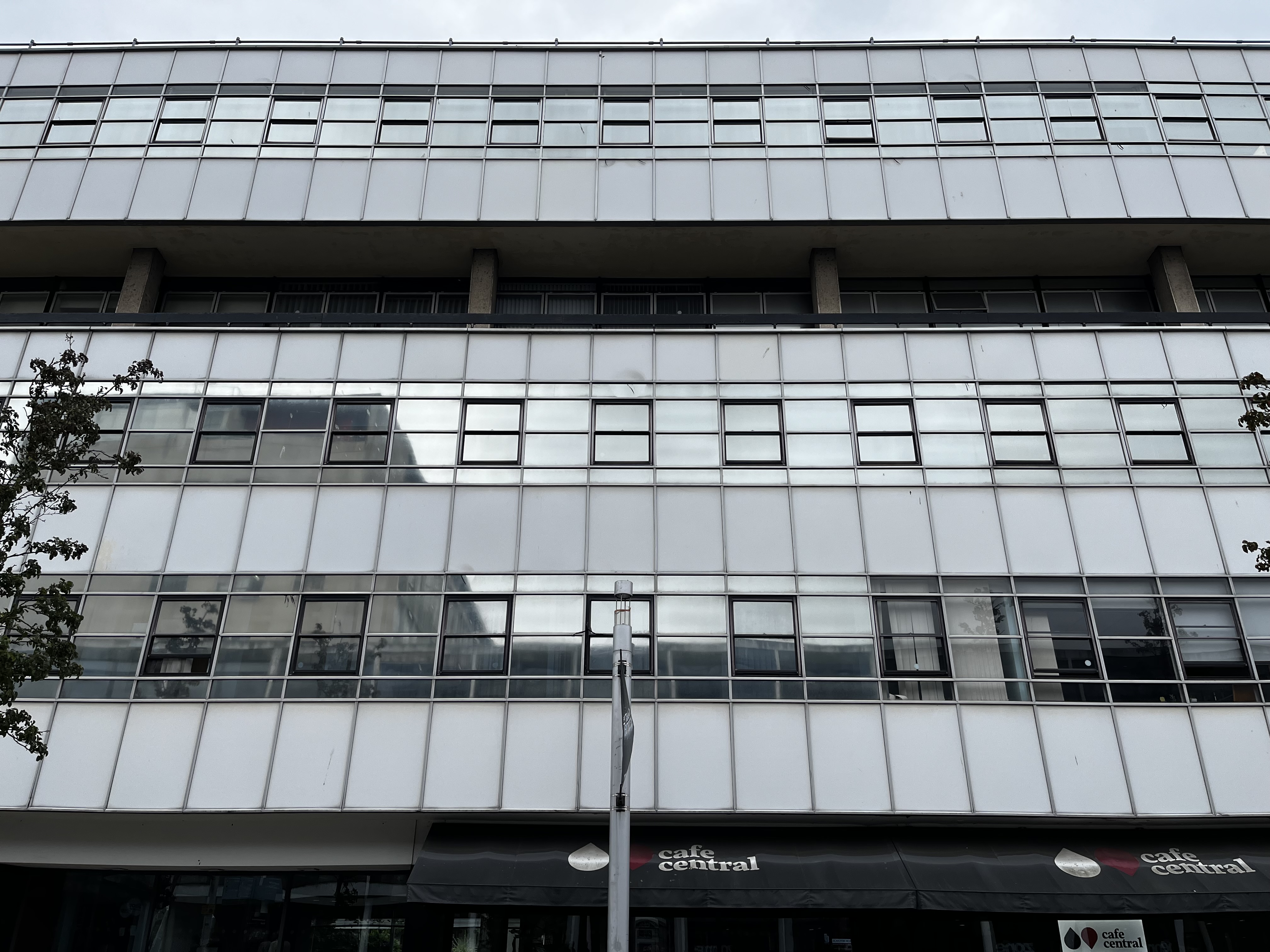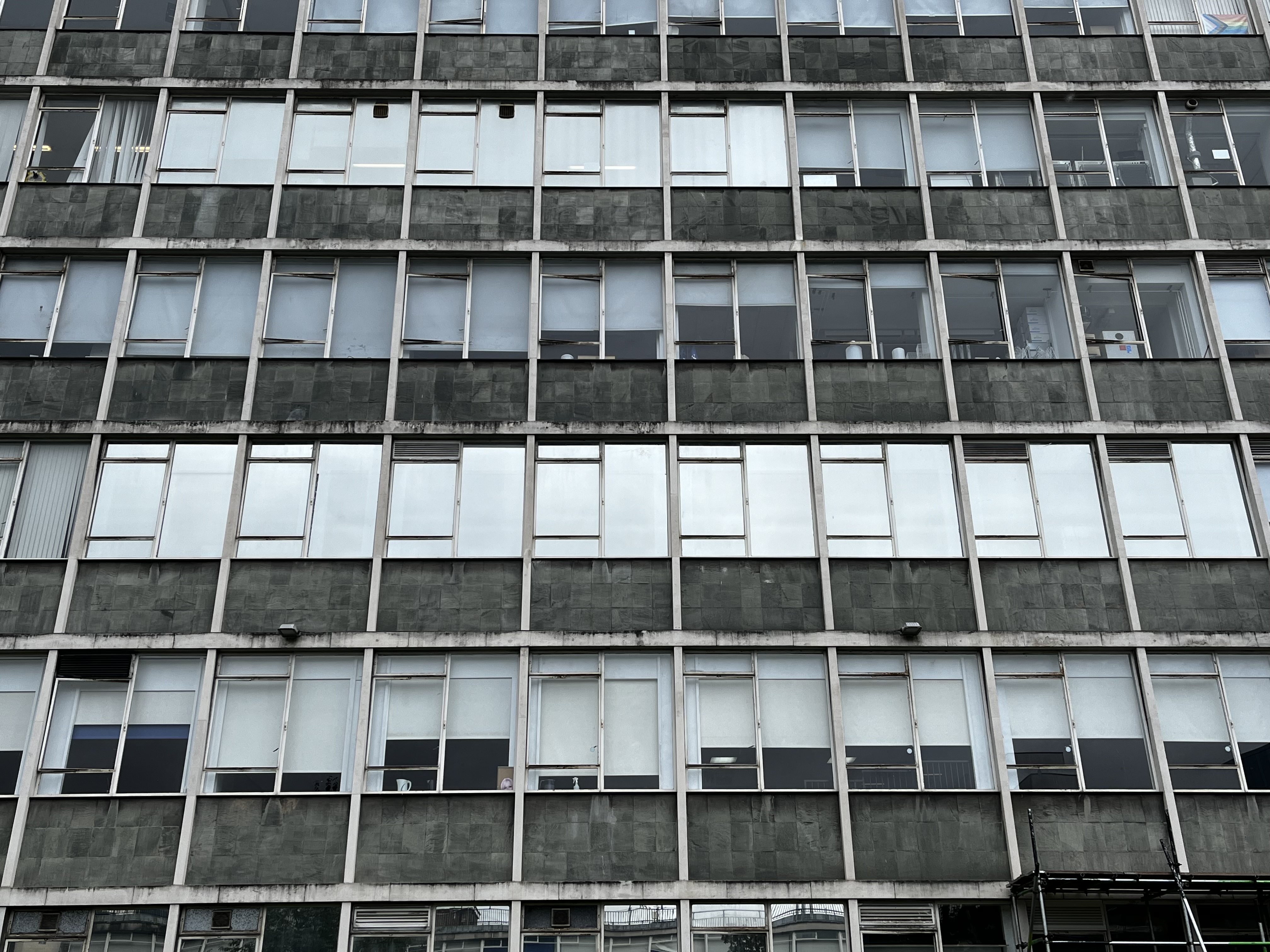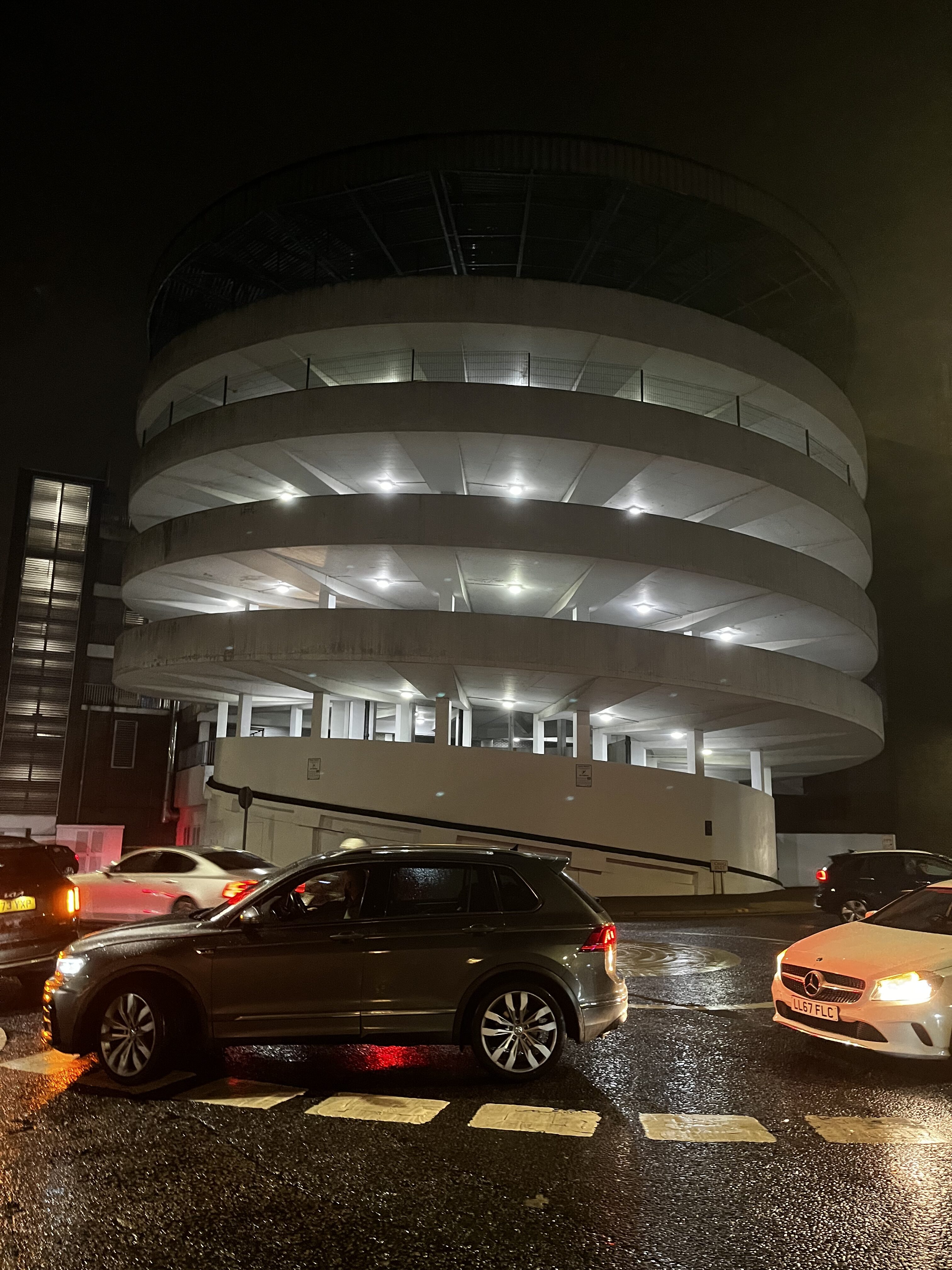
Goes to a new place; immediately goes down a back street and finds a car park.

Goes to a new place; immediately goes down a back street and finds a car park.
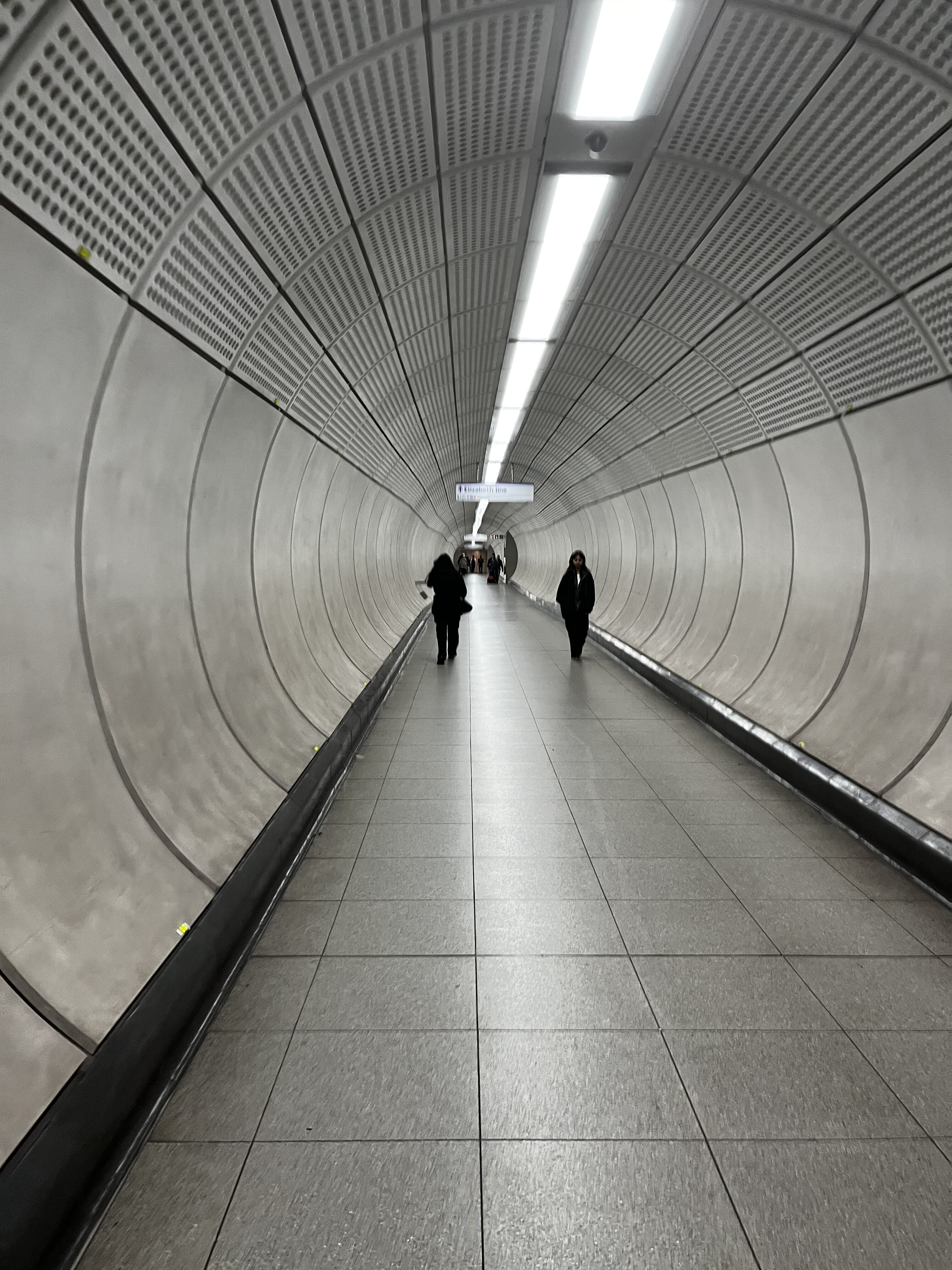
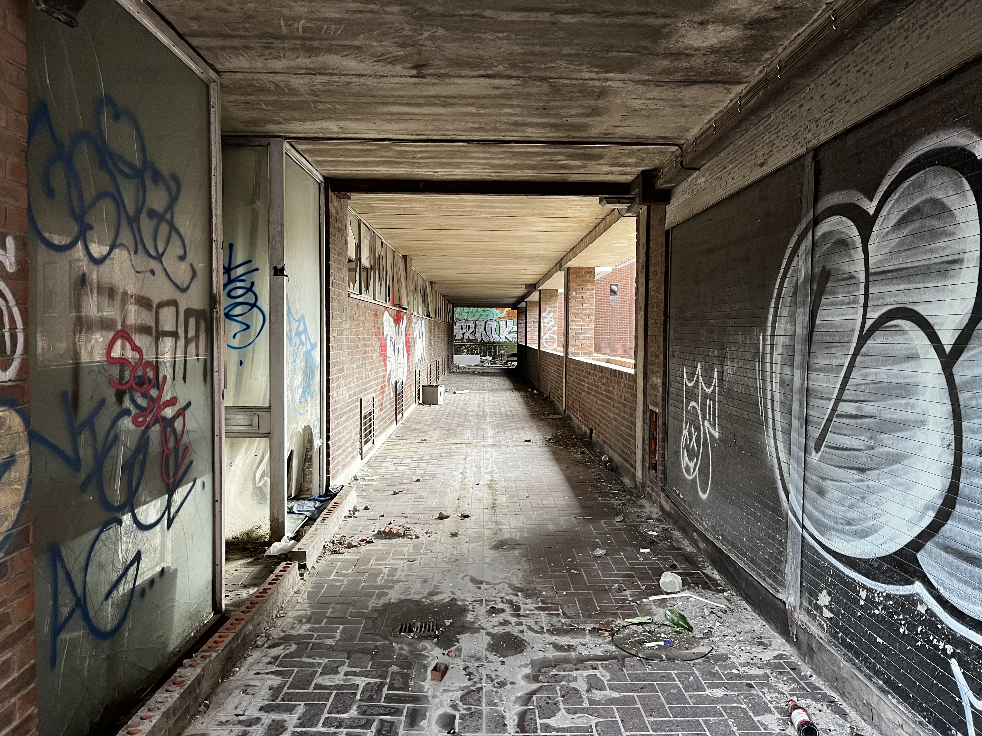
I thought CityMapper was sending me walkies round London for no reason but it was just trying to show me a very long, very repetitive pedestrian tunnel, DUH 🤦🏼♂️ And I’m so thankful for that!
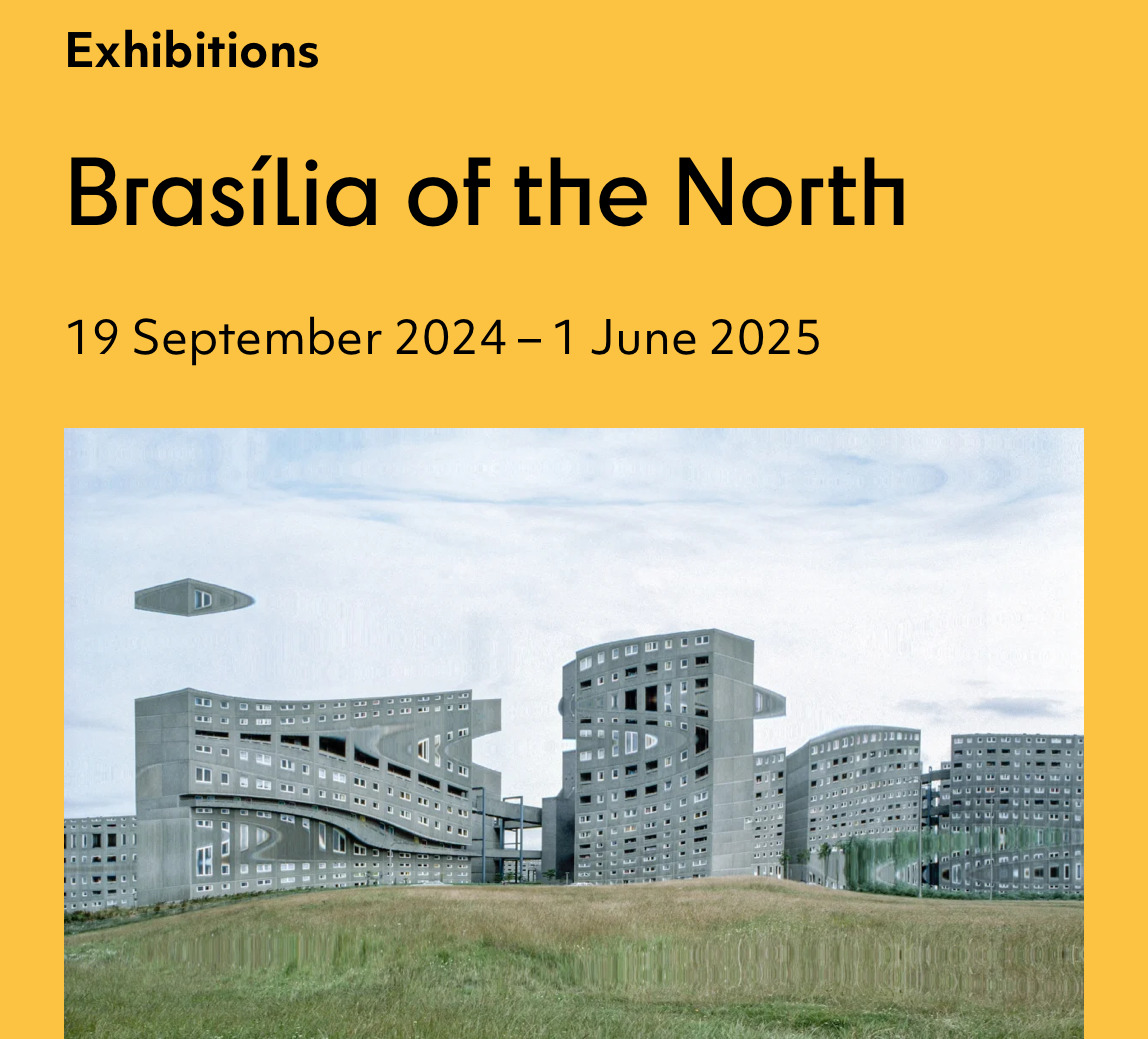
That brings our trip to Newcastle to a close. The last thing I wanted to highlight was the Brasília of the North exhibition at the Farrell Centre. We kindly got a preview of it the weekend before it opened, so my photos of it are not fit for public consumption, but I definitely recommend it.
An exhibition exploring the ideas, personalities and broader social, cultural and political climate that underpinned the aspirations to transform Newcastle into a modernist city.
It runs until 1 June 2025, is – ̗̀free ̖́- to visit, and included in it are several large scale models of Newcastle itself as well as select buildings in it – if that doesn’t sell it, I don’t know what will.
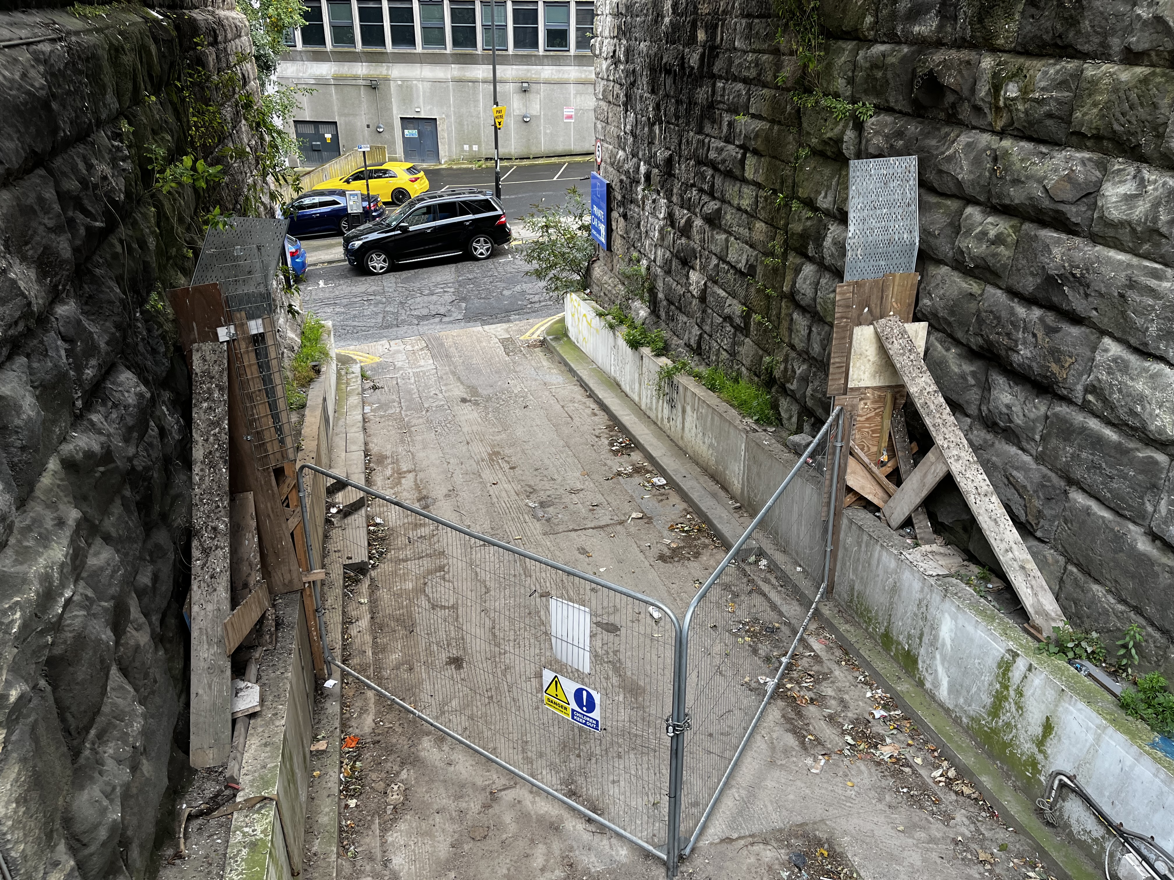
That jerry-rigged gate at the end is making me laugh to this day.
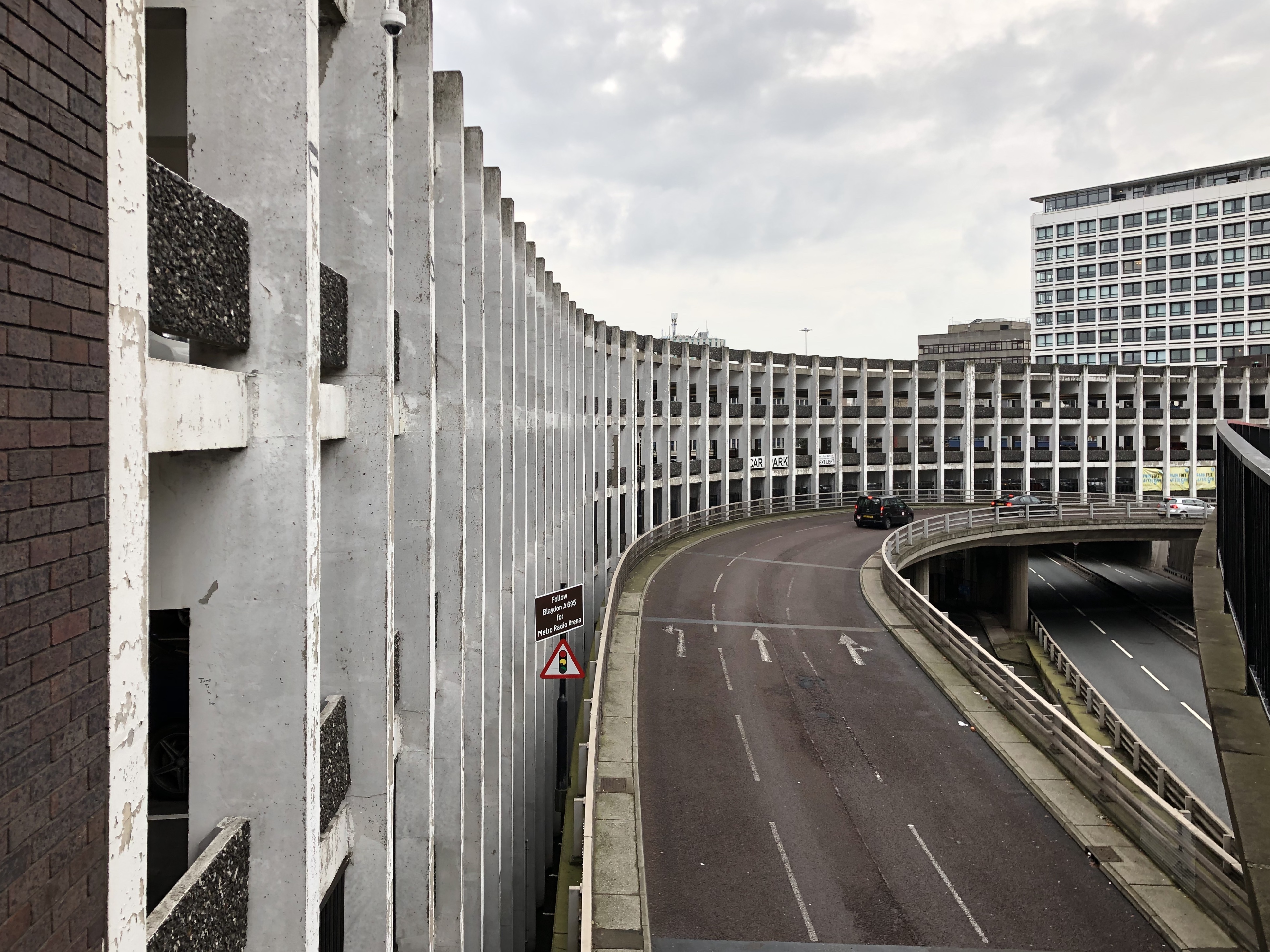
Here’s another photo of Manors Car Park from a previous trip. I am absolutely devoid of any photographic talent, or even skills (if any of the photos on this blog don’t have my fingers in the frame, it’s only because I cropped them out), but in this moment the shot just lined up right. Even the since-removed sign for the Metro Radio Arena looks right. I like it so much it’s been my iPad wallpaper for years.
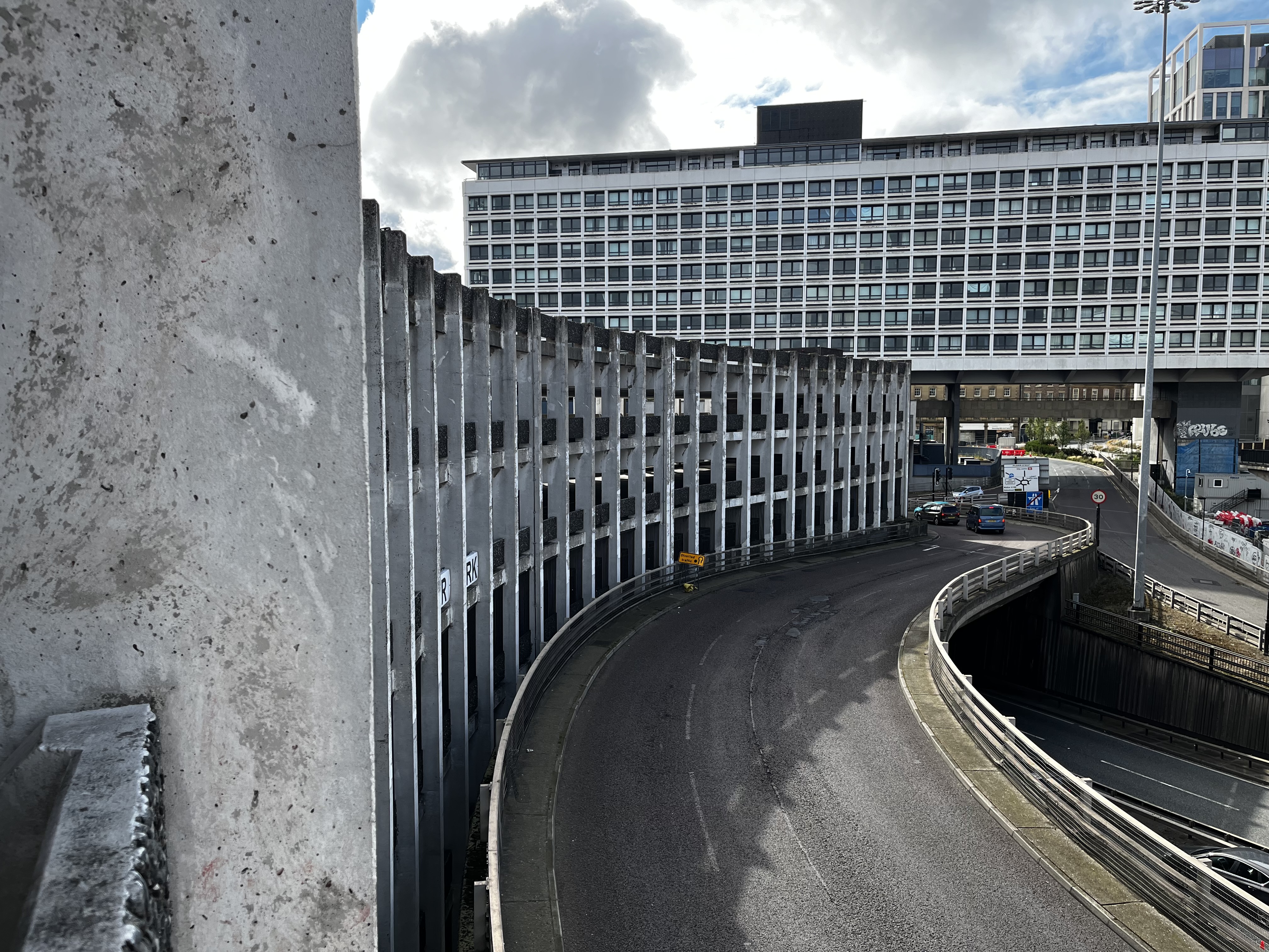
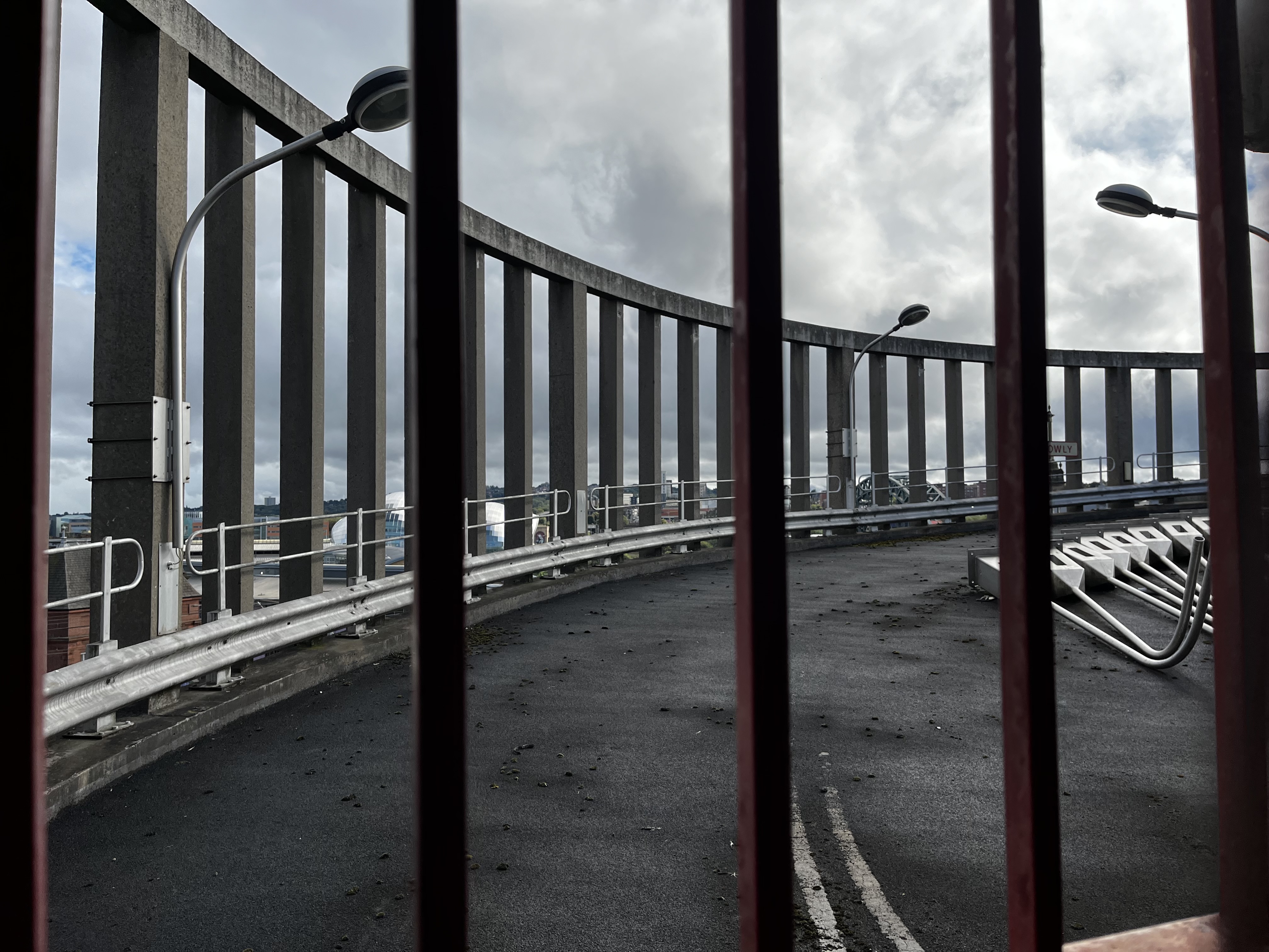
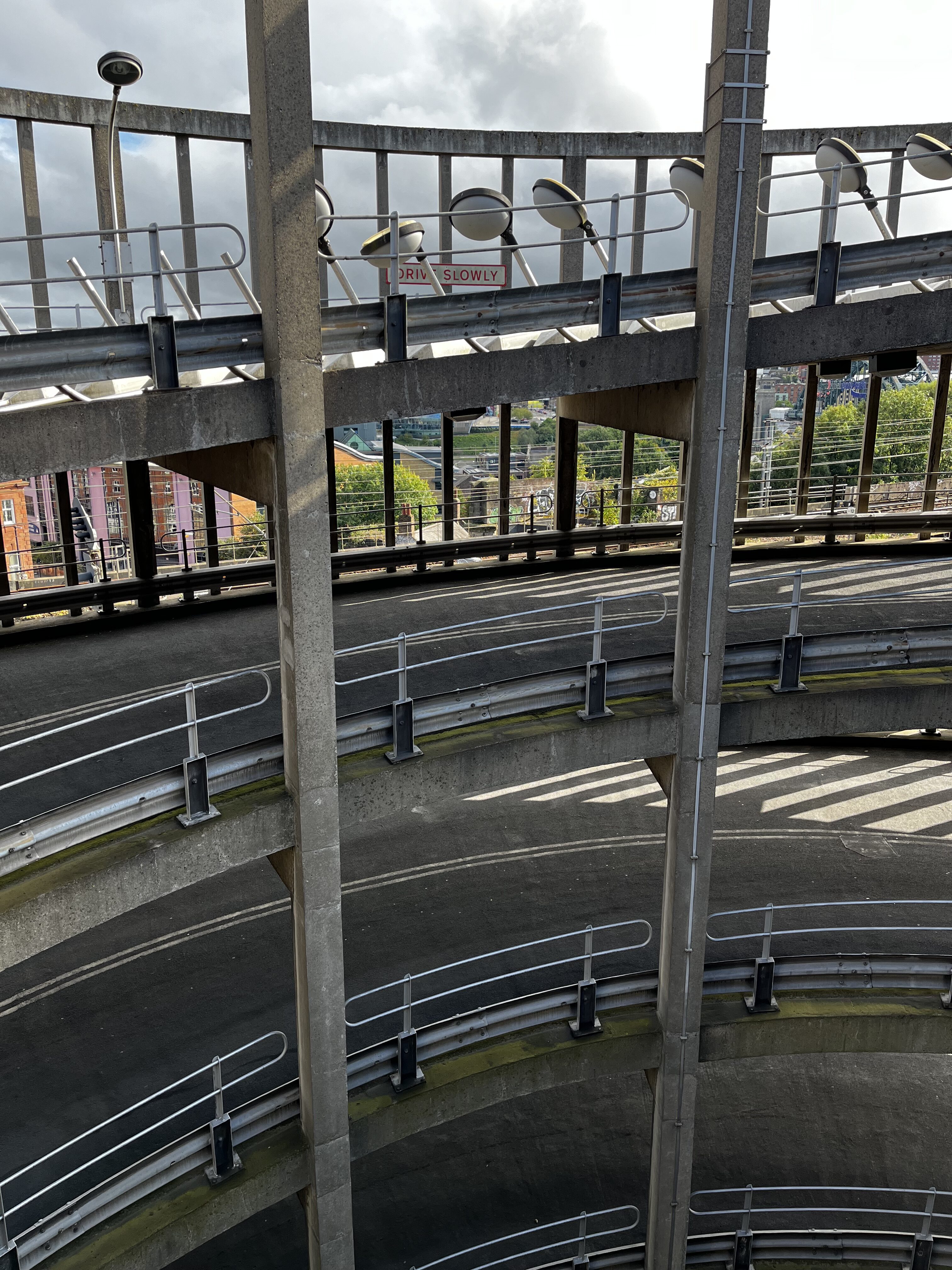
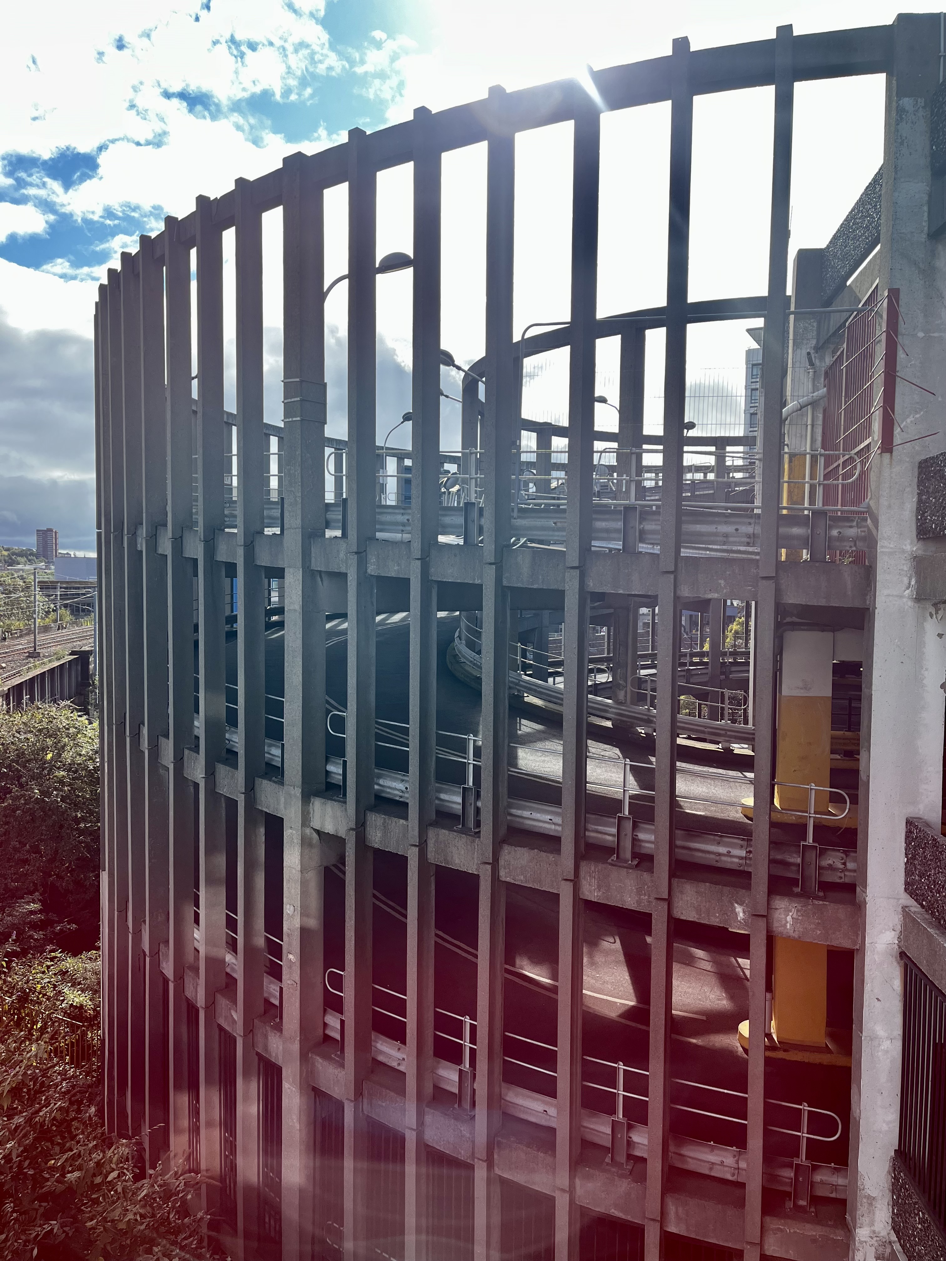
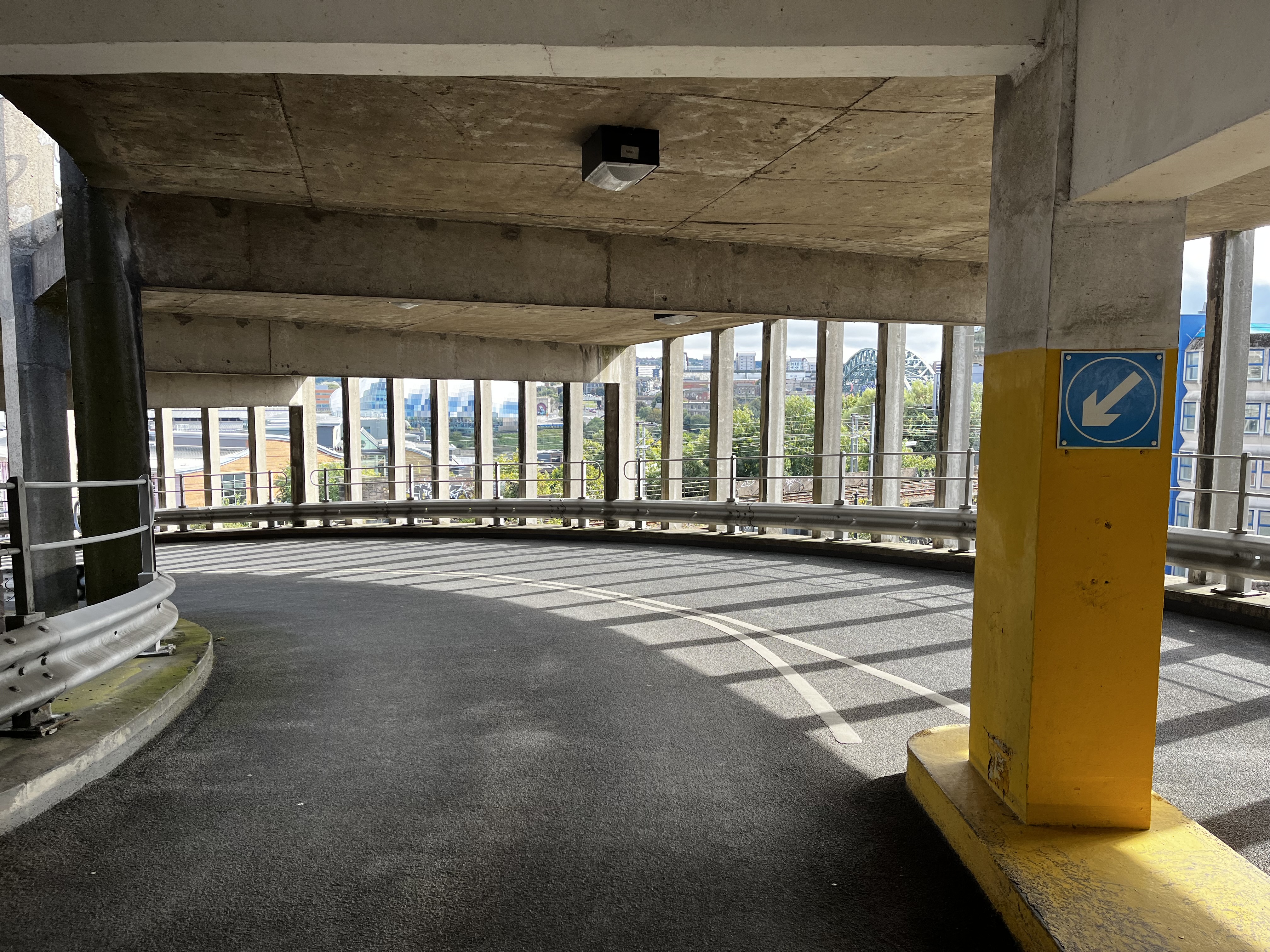
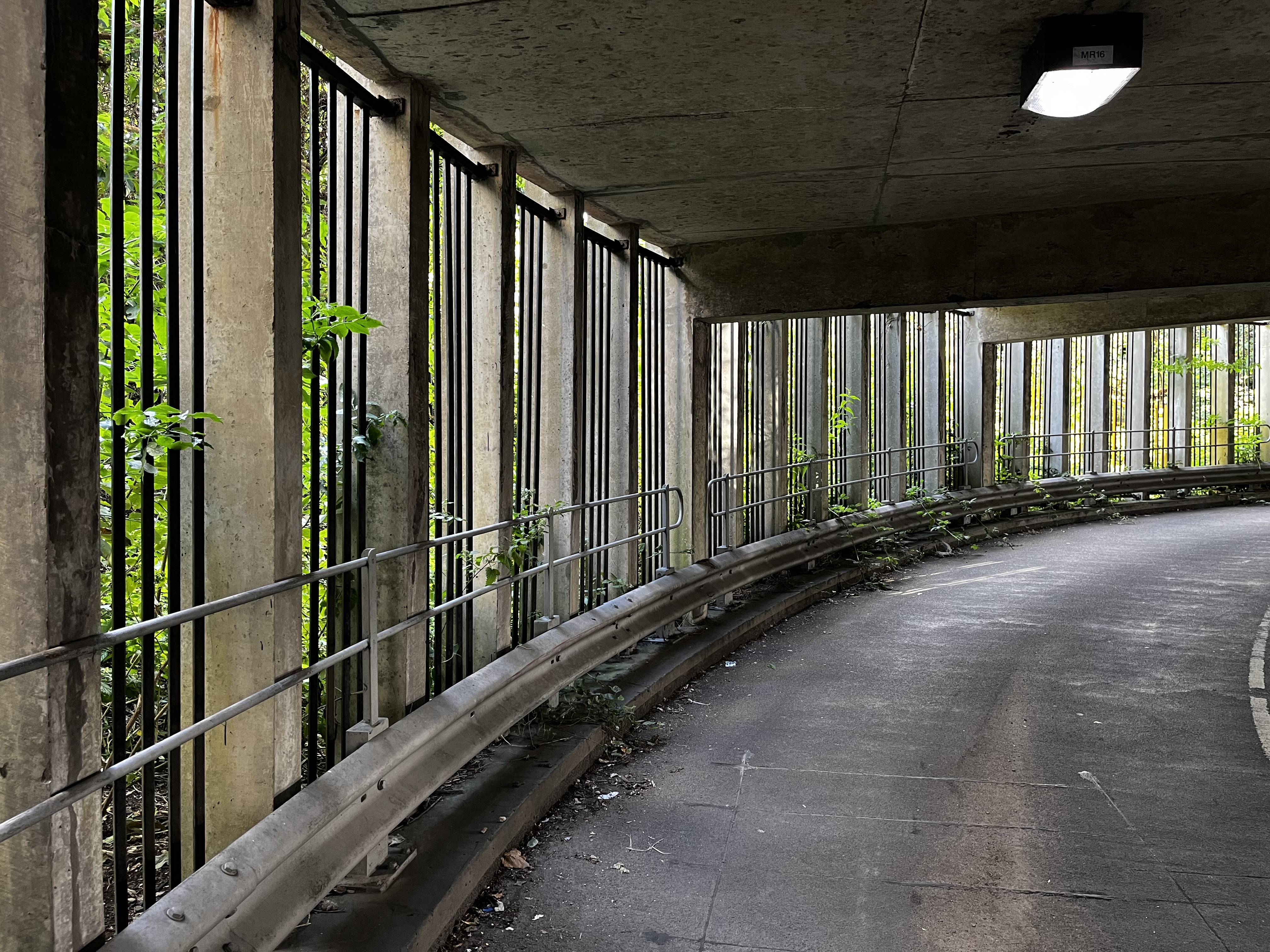
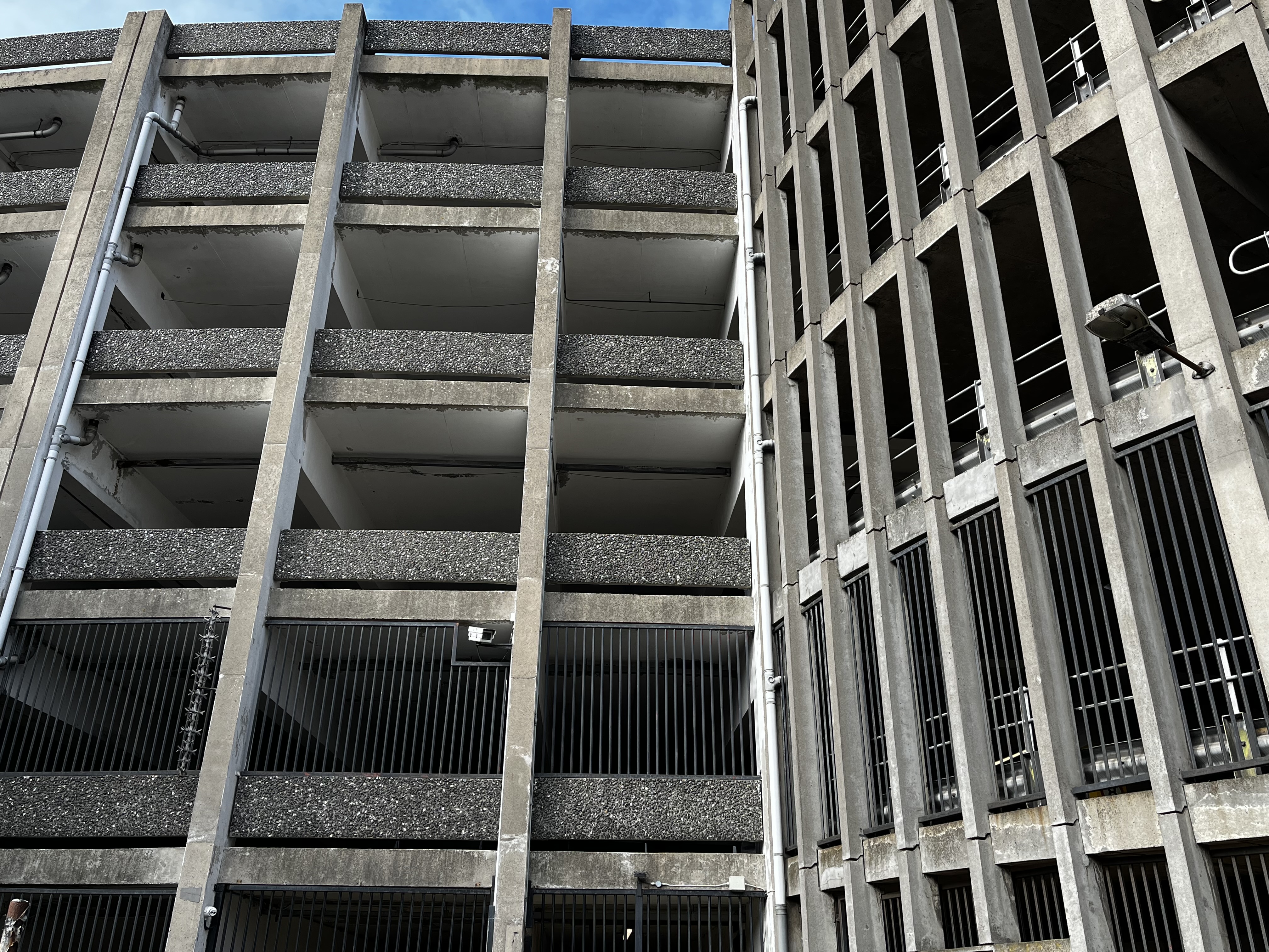
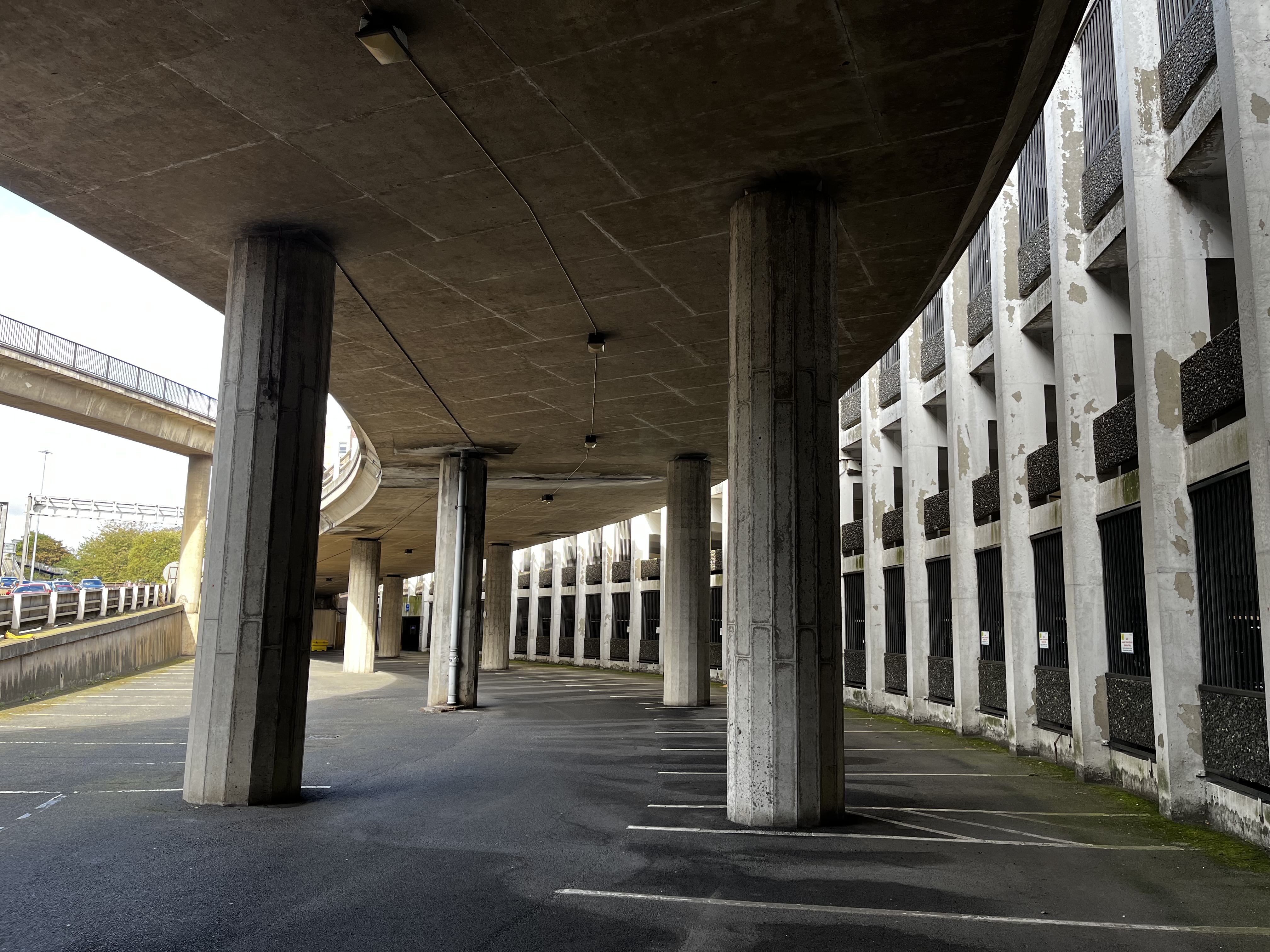
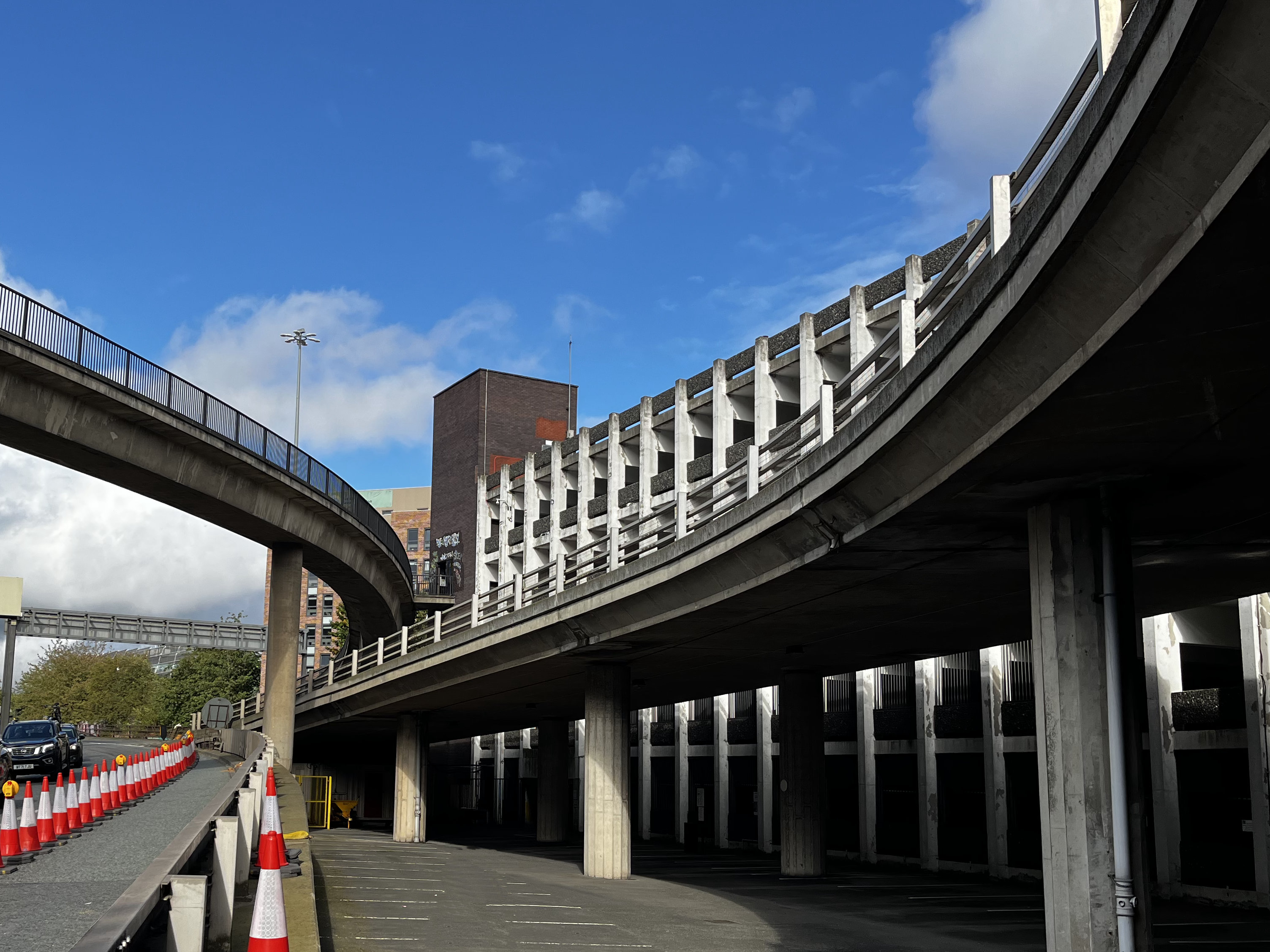
Manors has to be my favourite car park yet. This wasn’t my first visit to it, of course, I don’t decide my favourite car parks on a whim! I’ve used this phrase before, I’m sure, but there’s just something pleasantly geometric about the whole space — not just the upright and cross beams of the car park itself, which repeat in such a mesmerising pattern, but how it fits into the space, too, and how the A167(M), the junction off it, and the pedestrian foot bridge (which affords great views of the car park) fits around its curves too. We were lucky to see it just as the sun came out after a rather grey morning, it looked extra beautiful.
The plaque at the entrance says “Manors Car Park — The first civic multi-storey car park in Newcastle Upon Tyne was opened on 27th July 1971 by Alderman Arthur Grey, leader of the city council.”
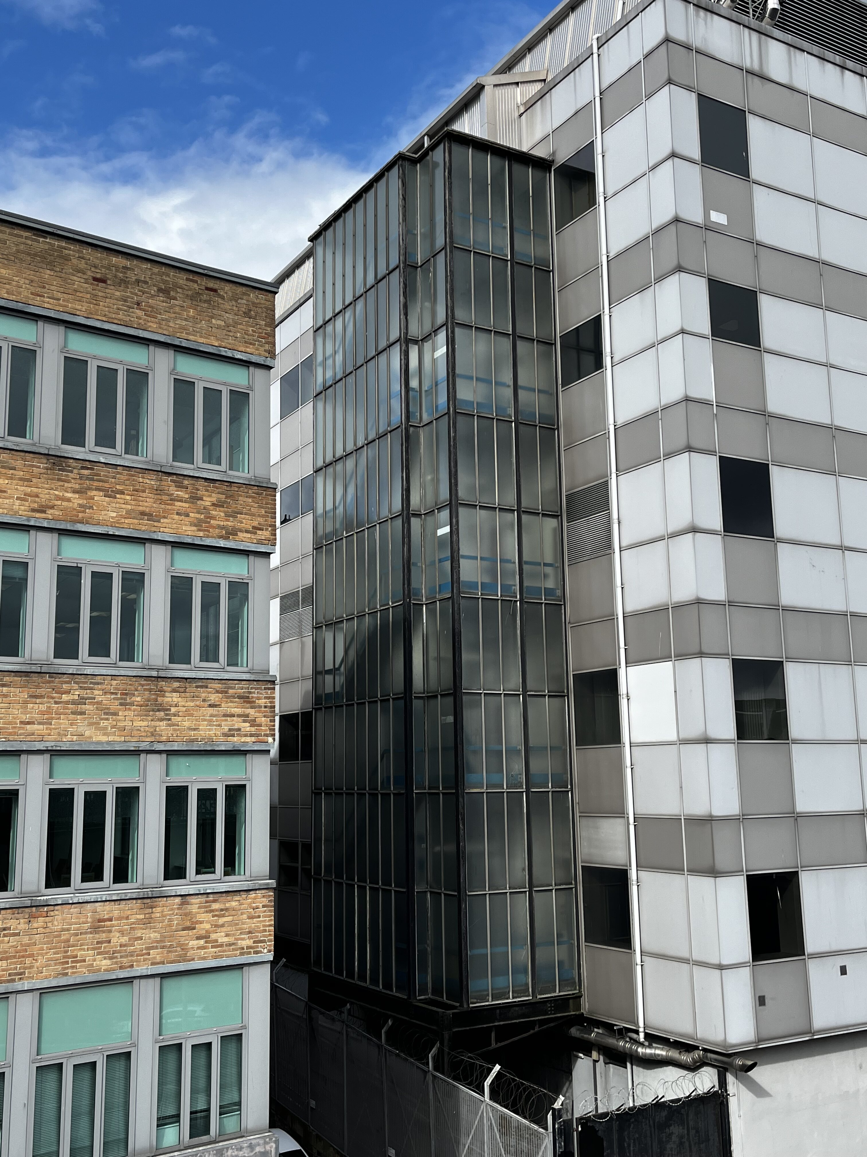
Great news everyone: STAIRCASE!
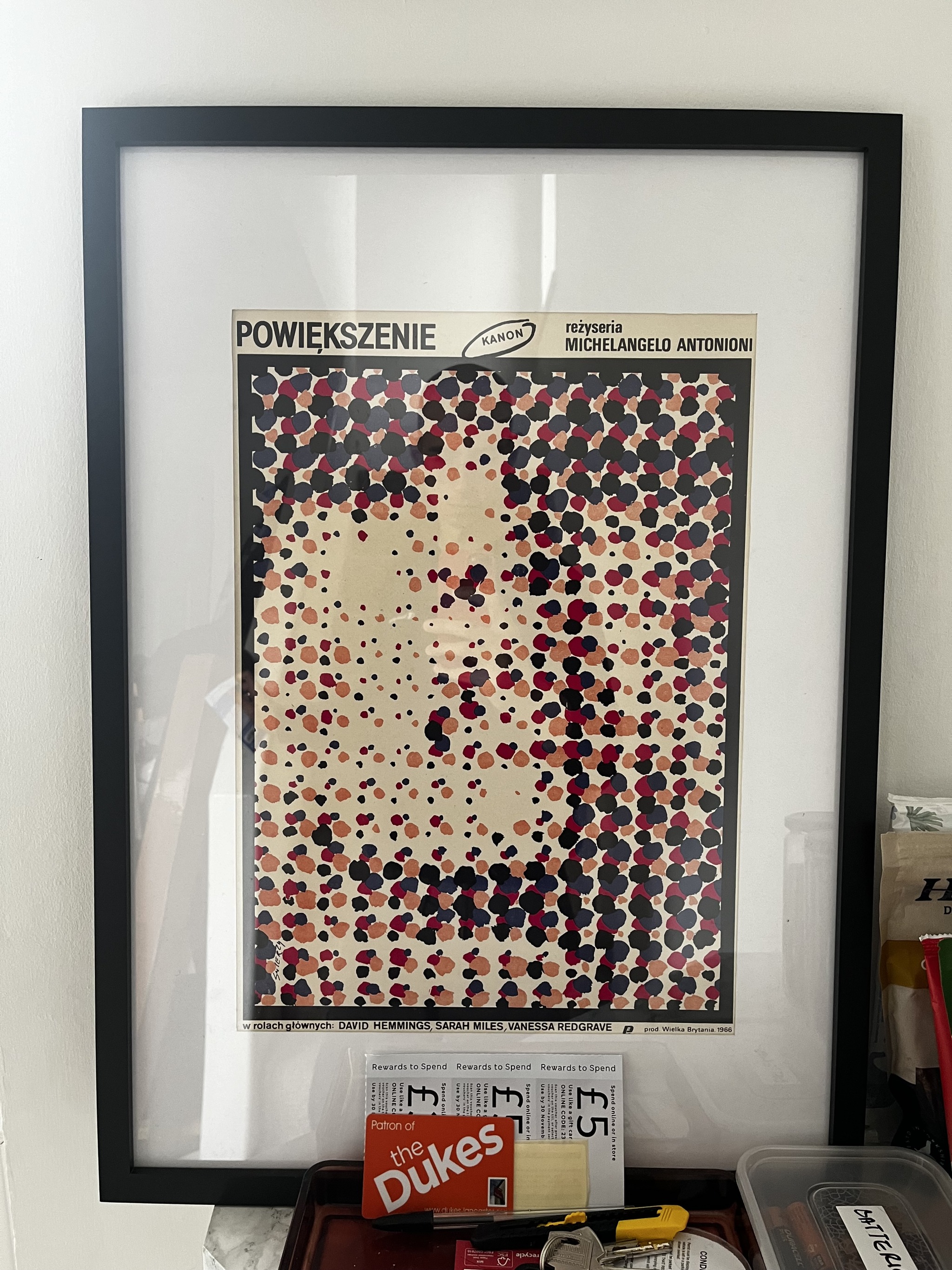
My friend Charlie read this article (The Insane History of Polish Movie Posters) the other day and ended up sending me a print of one of them, because he knew I’d like it, and he was obviously right. I was so excited to display it I whacked it on the nearest available surface, hence why it’s currently hiding behind M&S vouchers. I didn’t clock this initially, I was so taken in by the colours, but from the top of the stairs (and a little bit in this picture too) it looks like a face. It’s great.
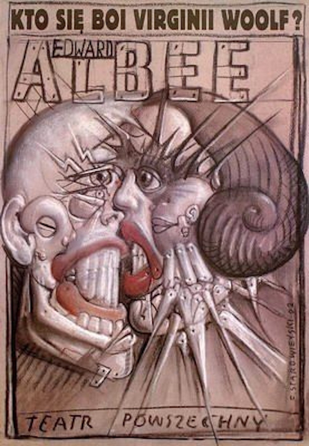
I promise not to turn this into a Polish Poster Blog, but another one of my favourites is the poster for “Who’s Afraid of Virginia Woolf?” by Franciszek Starowieyski. I have a print of it somewhere. I’ll level with you – it’s quite ugly! You’d think one of the keystones of good design is that the item is pleasing to look at, and this is anything but, so how exhilarating that an artist has the freedom to create something which doesn’t conform to that expectation? I think it catches your attention, which makes it very effective nevertheless. For a start, when I saw it on eBay I couldn’t stop thinking about it until I purchased it.
Here’s the article, and I recommend reading it if only to find out the fascinating reason behind why communist Poland had such a vibrant movie poster design culture.